Nutrabay: Redesigning the Path to Purchase
Users landed with clear intent and left before completing it. We redesigned the full discovery-to-decision journey, homepage, search, listing and product page, to remove the friction between intent and action.
View live websiteThe impact, up front.
Homepage to PLP conversion rate.
Increase in conversion from product page to checkout.
Reduction in time taken to complete a purchase from homepage to checkout.
Increase in returning users completing another order.
PLP to PDP conversion, driven by variant-level cards and decision nudges.
These results came from a single connected redesign across four touchpoints. No one screen explains the improvement, the journey does.
Traffic wasn't the issue, conversion was.
Nutrabay had strong traffic and a loyal user base, but the path from landing to purchase was full of friction. At every step of the funnel, we were losing users. Only 14% of homepage visitors reached a product listing page. Session recordings showed users typing search queries that led to dead ends because the search engine didn't understand their language. The same users were restarting their sessions from scratch because the platform had no memory of where they'd been. And users who reached the product page were dropping off before seeing the content that would have helped them buy.
The journey wasn't broken in one place. It was broken at every step, and with each step, the funnel lost more people. The brief started with the homepage. The data told us we couldn't stop there.
Business goals
One catalogue, four points of friction.
Who we designed for
New to supplements. Shops by health goal rather than product name. Needs education, authenticity signals and benefit clarity to build confidence before buying.
Regular buyer. Broadly knows what they want, open to alternatives. Compares prices across platforms. Deal-driven and brand-aware.
Knows exactly what they want. Prioritises per-serving specs, variant availability and speed. Doesn't need convincing, needs to locate and buy fast.
Sports nutrition is a high-repeat-purchase category. The same user buys the same protein, same flavour, same weight every 6 to 8 weeks. The design had to support that behaviour, not make users reconstruct it from scratch each time.
Research methods used
Research by page
GoalHelp users orient immediately, understand what Nutrabay sells, trust that it's authentic, and find their path based on how they naturally shop. Reduce dependence on search and menu as the only entry points. Add session continuity so returning users never restart a journey they've already started.
Research methods: 1:1 user interviews, NPS survey, heatmap and click zone analysis, 100+ Clarity session recordings.
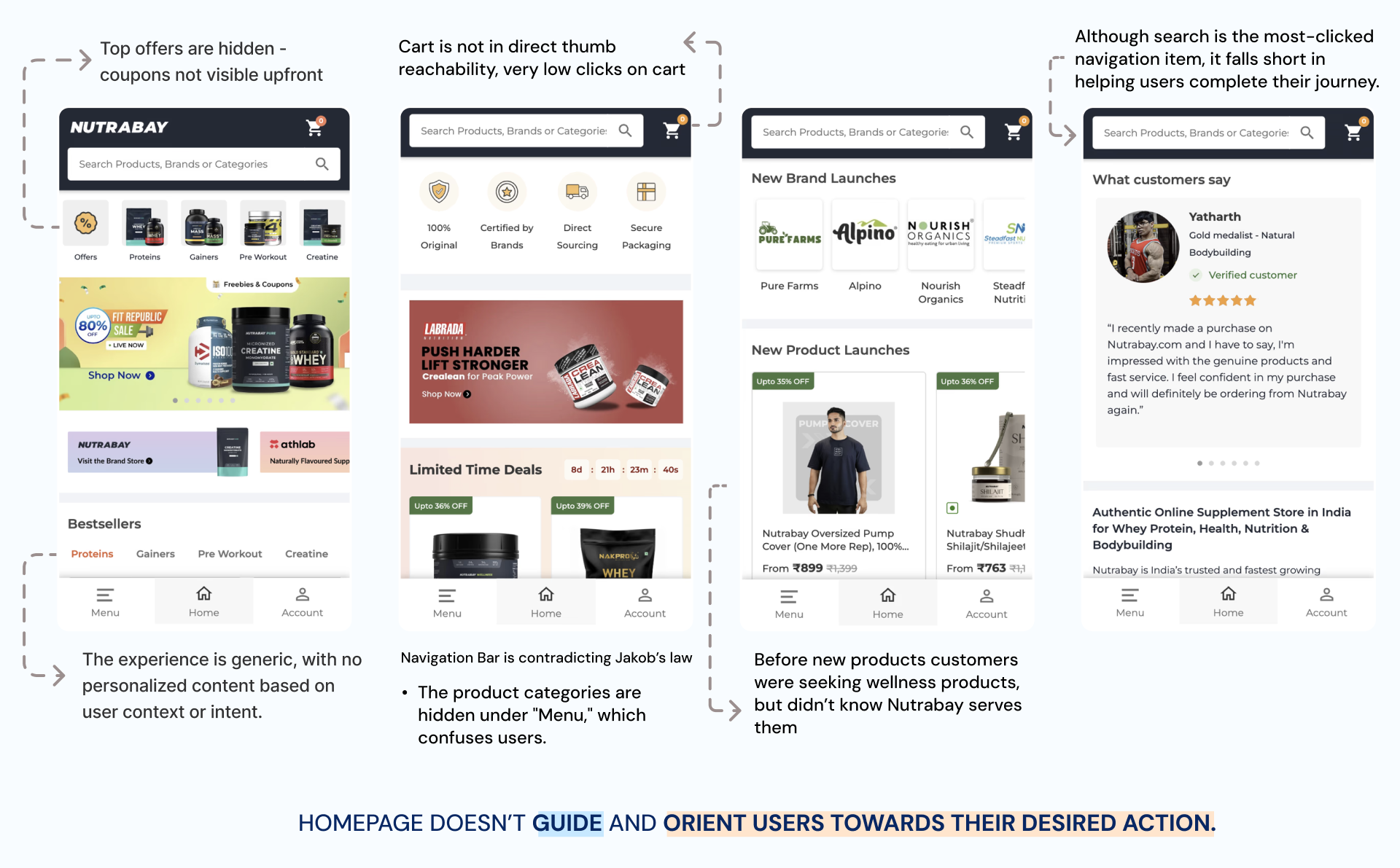
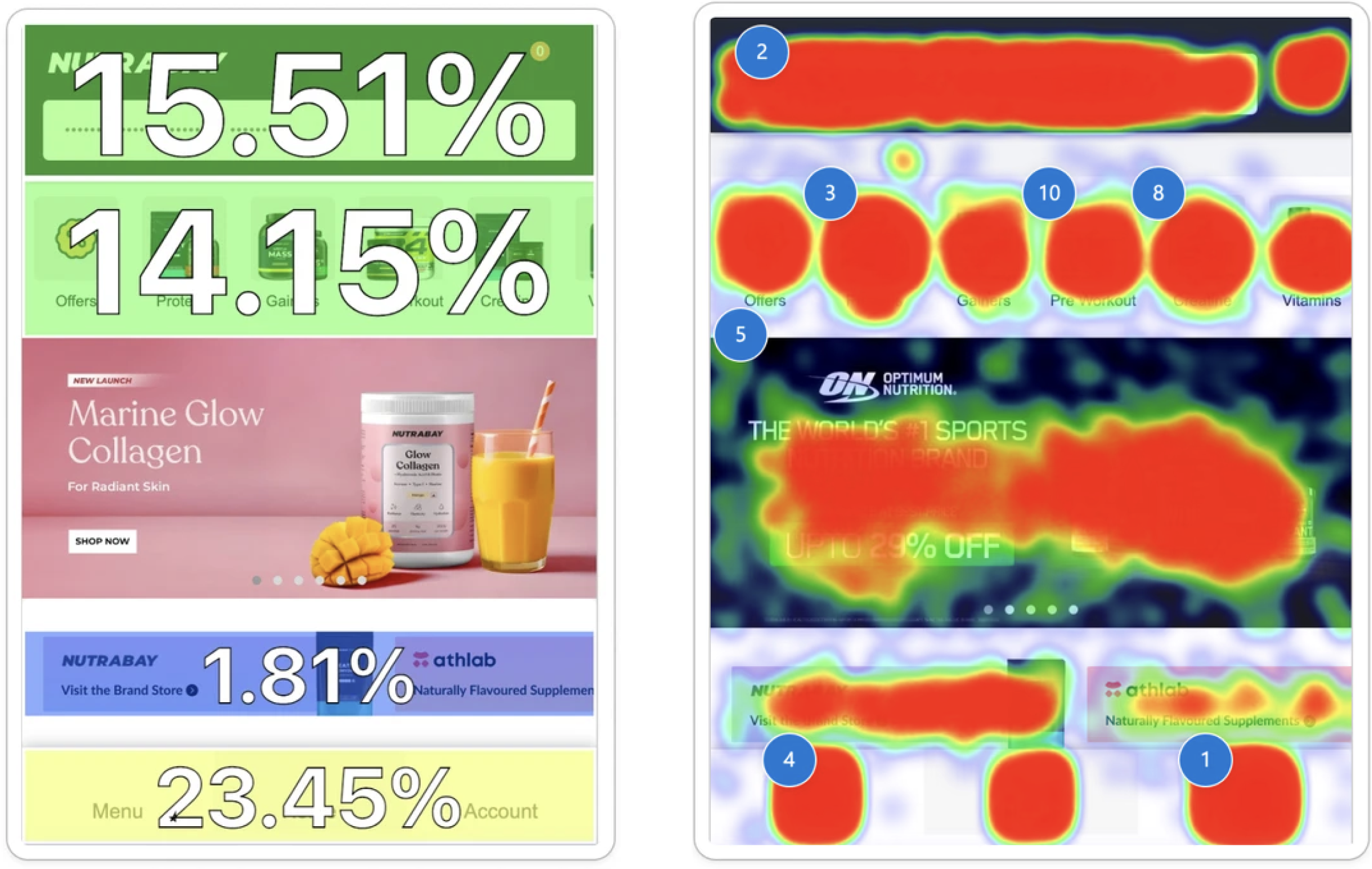
Only 14% of homepage visitors moved to the PLP, a direct signal that the page was not converting intent into action. The second-highest click on the homepage was the search bar, so most users who arrived with intent had to find their own way in.
Homepage banners received almost zero engagement. The Brand Redirection section received no clicks, designed content with zero measurable value.
Menu and Account tabs were the most-used navigation elements, users were routing around the page rather than through it.
Users weren't discovering the full catalogue: "I need multivitamins, do you guys have that?" said by a returning customer. The homepage was not communicating breadth.
Session recordings showed users leaving mid-browse and restarting the exact same search in a new session. There was no mechanism to resume (Nielsen's Heuristic #6, recognition over recall).
In a repeat-purchase category, this is particularly costly. A user restocking their protein every 6 weeks should not have to rebuild that journey from scratch each visit.
Authenticity of products was the top purchase driver in NPS data, yet nothing on the homepage communicated this above the fold.
- Users value Nutrabay for authentic products, attractive deals, and wide variety of brands on one platform.
- "Health & Fitness" and "Bodybuilding" are the top two goals, followed by "Weight Loss."
- Trust is key. Authenticity is the top factor in choosing a supplement store, users prioritize genuine products and brand trust over pricing or variety.
- Low brand awareness. Users don't know the full range on offer, "I need multivitamins, do you guys have that?" signals limited understanding of the catalogue.
- Goal-oriented shopping. Users shop by health goal (weight loss, muscle gain) rather than product name, a need for guided, goal-based discovery.
- Price-sensitive deal hunters. Users actively compare the same product across sites, clear discounts and value are major decision drivers.
- High repeat purchase behaviour. A large share of users are repeat customers, mainly returning to restock products they already know.
- New vs. returning users decide differently. Returning users compare pricing on a product they already trust; new users decide on trust signals and a clear discount before anything else.
GoalMake catalogue depth visible on entry, before the user types anything. Support all shopping modes: keyword, category, brand, goal. Fix term-matching so user language maps reliably to catalogue results. Bring product discovery directly into the search experience so users reach their product faster.
Research methods: session recordings, UX audit, user interviews, search term analysis.
Session recordings showed a repeated pattern: users typed a search query and landed on a results page with no relevant products, a dead end. This wasn't a content gap, it was a matching gap.
Algolia research shows 68% of e-commerce sites fail to return useful results for synonym-based or slightly varied queries. Trust in the catalogue erodes with every dead end.
The second-highest click on the homepage was the search bar. A significant proportion of user intent was funnelled into search, and a meaningful portion of that was failing silently.
Search was text-only with no visual scaffolding. Users who shop by brand or fitness goal had no pathway, they had to know the exact product name to get anywhere.
There was no category navigation, no product previews on entry, no way to browse from search. Users either typed and hoped, or fell back to the menu.
Solution direction: instead of showing only text suggestions on typing, the redesigned search surfaces actual products and category tiles immediately on entry.
GoalGive users enough information on the listing card to make a confident decision without leaving the page. Remove the round-trip to PDP for basic comparison. Surface variant detail, pricing and decision nudges directly. Restore the browsing freedom and control the old filter and display structure had removed.
Research methods: session recordings, user interviews, UX audit, filter interaction analysis, funnel data.
The old PLP displayed products at parent level, "Whey Protein from ₹X," rather than at variant level. The only route to variant discovery was through the filter panel, which was not intuitive.
Autonomy and control: users who feel they cannot navigate freely disengage faster. When the mechanism for discovery is invisible, the page feels like a dead end.
Session recordings showed users repeatedly clicking into a PDP to check a variant's details, going back to PLP, clicking a different product, going back again. Users had no comparison capability on the listing itself.
Miller's Law: working memory holds 7±2 items. Forcing users to hold variant details from multiple PDP visits in memory is inherently fragile, and a direct cause of drop-off.
Product cards had no signals to help users choose confidently. No "Bestseller" tag, no "Sold X times," no "Top Rated," no "Previously Purchased" indicator.
Cialdini, social proof and bandwagon effect: bestseller and sold-X-times signals actively reduce decision paralysis by confirming other users chose confidently.
50% of users who applied filters converted to the next page. Filters were working as a conversion mechanism, but the filter panel design was obscuring this.
No way to identify or restock a previously purchased product from the listing page, a missed opportunity on every return visit in a repeat-purchase category.
GoalMove the content that builds purchase confidence into the first two folds, where users actually are. Surface social proof, nutrition, offers and trust signals before the 75% drop-off point. Reduce effort to compare variants, find relevant information and take action. Add recovery for dead-end states. Make repeat restocking frictionless.
Research methods: 1:1 user interviews, heatmaps, Clarity session recordings, NPS survey, competitive analysis.
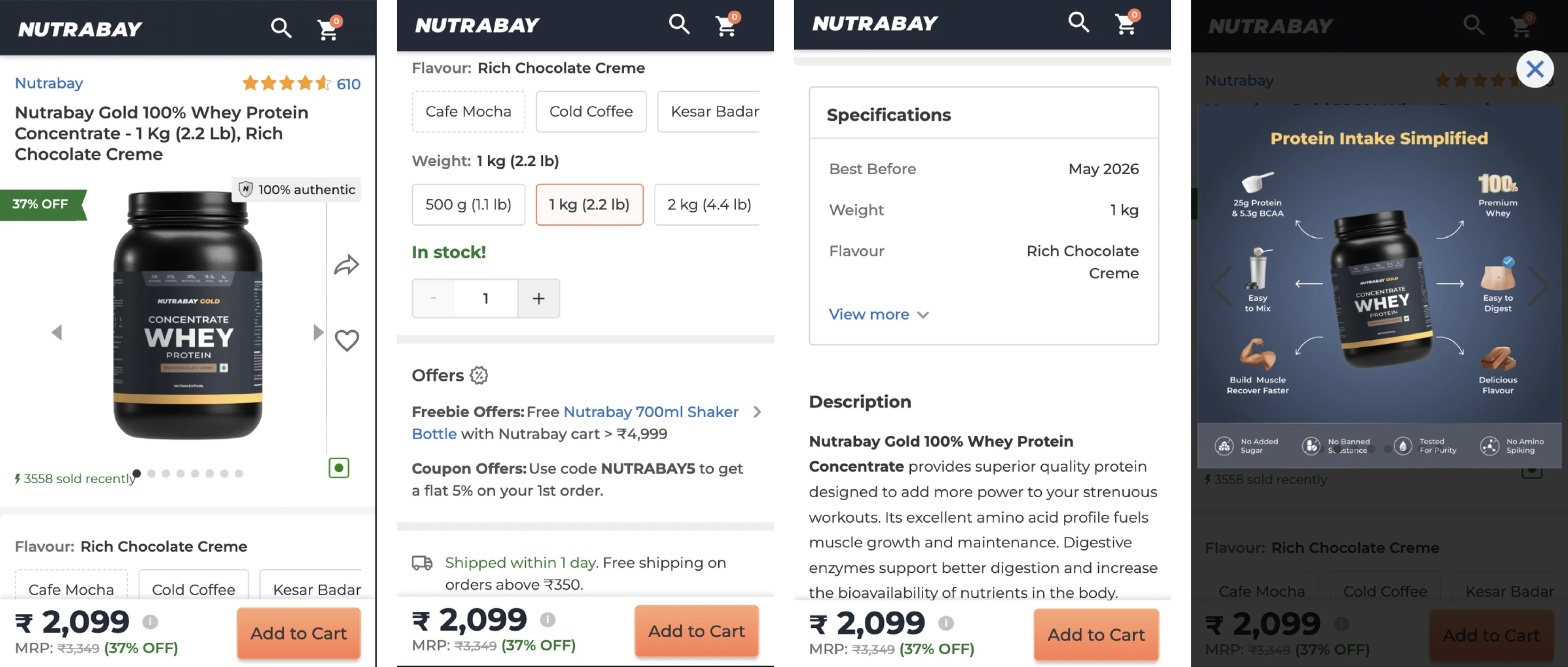
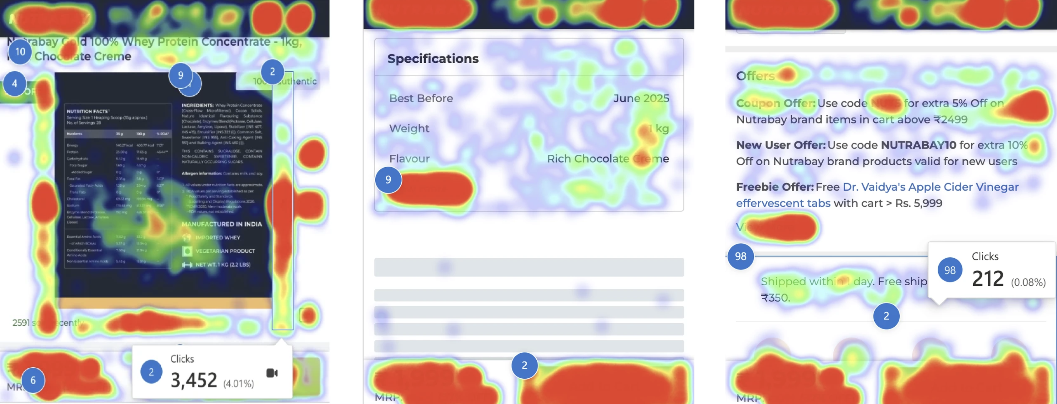
Heatmaps showed 75% of users dropped off before reaching the nutritional information section, yet users who reached it stayed and read it carefully. The content was right, its position was wrong (Baymard Institute, information scent).
The specifications section, primary decision factor for beginners, was buried below where 75% of users stopped scrolling.
Users tapped through every flavour and size swatch to check per-variant pricing, a high-effort interaction for frequently needed information (Fitts's Law and cognitive load).
Out-of-stock swatches had no recovery path, a dead end with no notify-me option.
Offers section was below the fold, but deals were the second-highest purchase motivator in NPS data.
Only 30% of users reached the reviews section. Those who did spent significant time on photo reviews and transformation images (Cialdini, social proof).
NPS confirmed authenticity as the top reason users chose Nutrabay, but the PDP had no lab reports, no certificates, no third-party verification.
No memory of a user's previous variant selection. Every visit started blank, same flavour re-selected from scratch on every restock (Peak-End Rule).
How might we close the gap?
How might we turn the homepage into a page that converts intent into action, when only 14% of visitors were moving to the PLP?
How might we address authenticity, the top purchase driver in NPS data, when nothing on the page communicated it?
How might we help users understand the breadth of categories on offer and guide them toward products that match their own health goals?
How might we help users navigate quickly, in a way that's easy to remember, so they can explore and reach their product with ease?
How might we help users compare and decide from the listing itself, without forcing repeated trips to the PDP?
How might we improve filter discoverability, when applying filters made users 2x more likely to convert, yet only 8% used them?
How might we aid decisions the system can't fully know, by using behavioural and purchase data to suggest products, so search never dead-ends and comparison gets easier?
How might we make deep product information easy to absorb, with a hierarchy clear enough that users can quickly check if a product fits their health goals?
One key decision, per page.
Homepage
Rebuild the homepage to communicate what Nutrabay sells, why to trust it, and give every user type a clear path within the first fold. Add session continuity. Build a backend content management layer so the platform's goal-based sections can be managed and updated by business teams without engineering dependency.
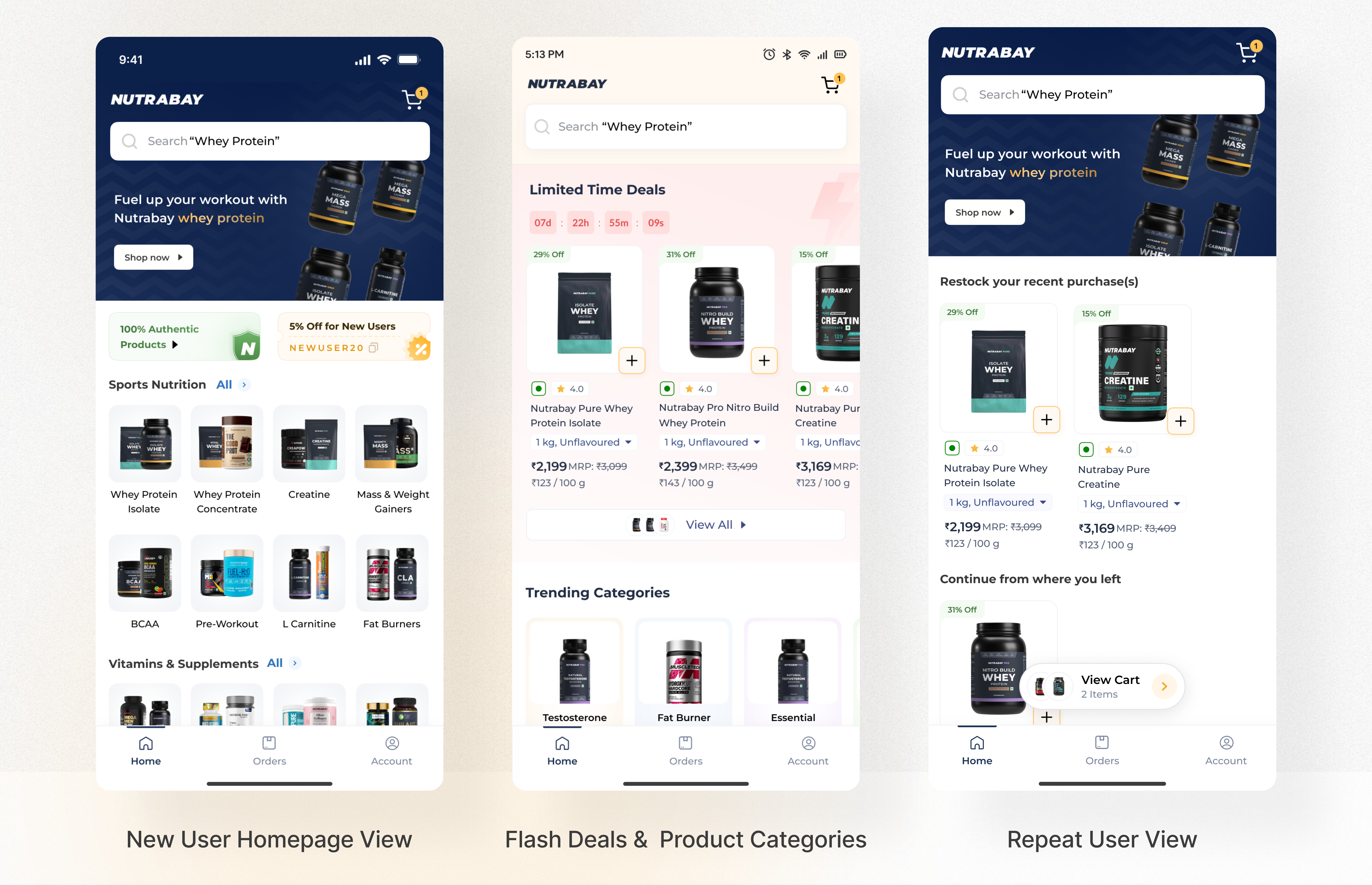
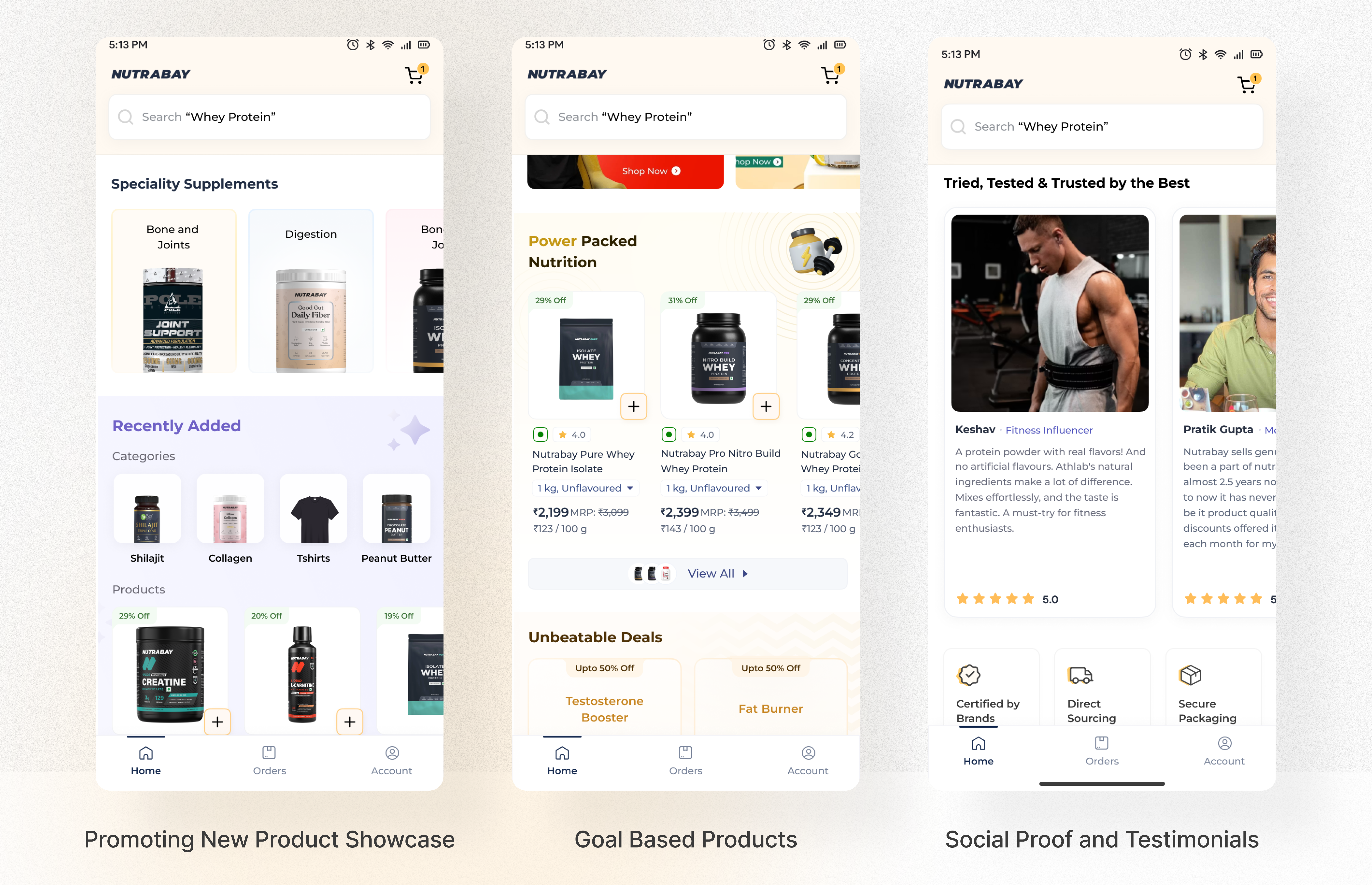
- First fold redesigned: replaced zero-engagement banners with visible product categories and an authenticity callout, "Tried, Tested & Trusted," addressing the top NPS trust gap above the fold.
- "Restock Recent Purchases" section added, one-tap reorder of previously bought products. The system does the remembering, the user doesn't have to (recognition over recall).
- "Continue your last session" entry point, users who left mid-browse can resume, eliminating the restart loop Clarity recordings showed repeatedly.
- New launches and brand spotlight section, surfaces emerging products users were unaware of.
- UGC, expert testimonials and USPs added, reinforcing trust for users who scroll further.
- Orders moved to bottom navigation, most common repeat-user action, one tap away.
- Brand Redirection section removed, replaced with content that serves user intent.
- Floating cart button added above the bottom nav bar, kept within thumb reach on one-handed mobile use rather than tucked in a top corner (Fitts's Law: the closer and larger the target, the faster and more accurate the tap). Cart is the highest-intent action on the page, it shouldn't cost a hand-shuffle to reach.
- New and returning users see the same homepage but need different things from it: new users need trust signals before anything else, returning users need faster discovery and easy repurchase. "Tried, Tested & Trusted" and category browsing serve the former; "Restock Recent Purchases" and "Continue your last session" serve the latter.
- Goal-based product sections, for example "For Muscle Gain," "For Women's Health," "For Pre-Workout," are powered by a Page Manager, a backend module built by engineering that lets sales, merchandising and marketing configure and update these sections independently, without a design or engineering ticket.
- Teams can map products to user intent categories and update them based on business priorities, seasonal campaigns or stock availability.
- The homepage is not a static design artefact, it is a configurable, business-driven surface. The design provides the structure and intent logic, the backend gives the business team control to keep it relevant. A deliberate systems-thinking decision: design for flexibility, not just the current state.
Designs discarded
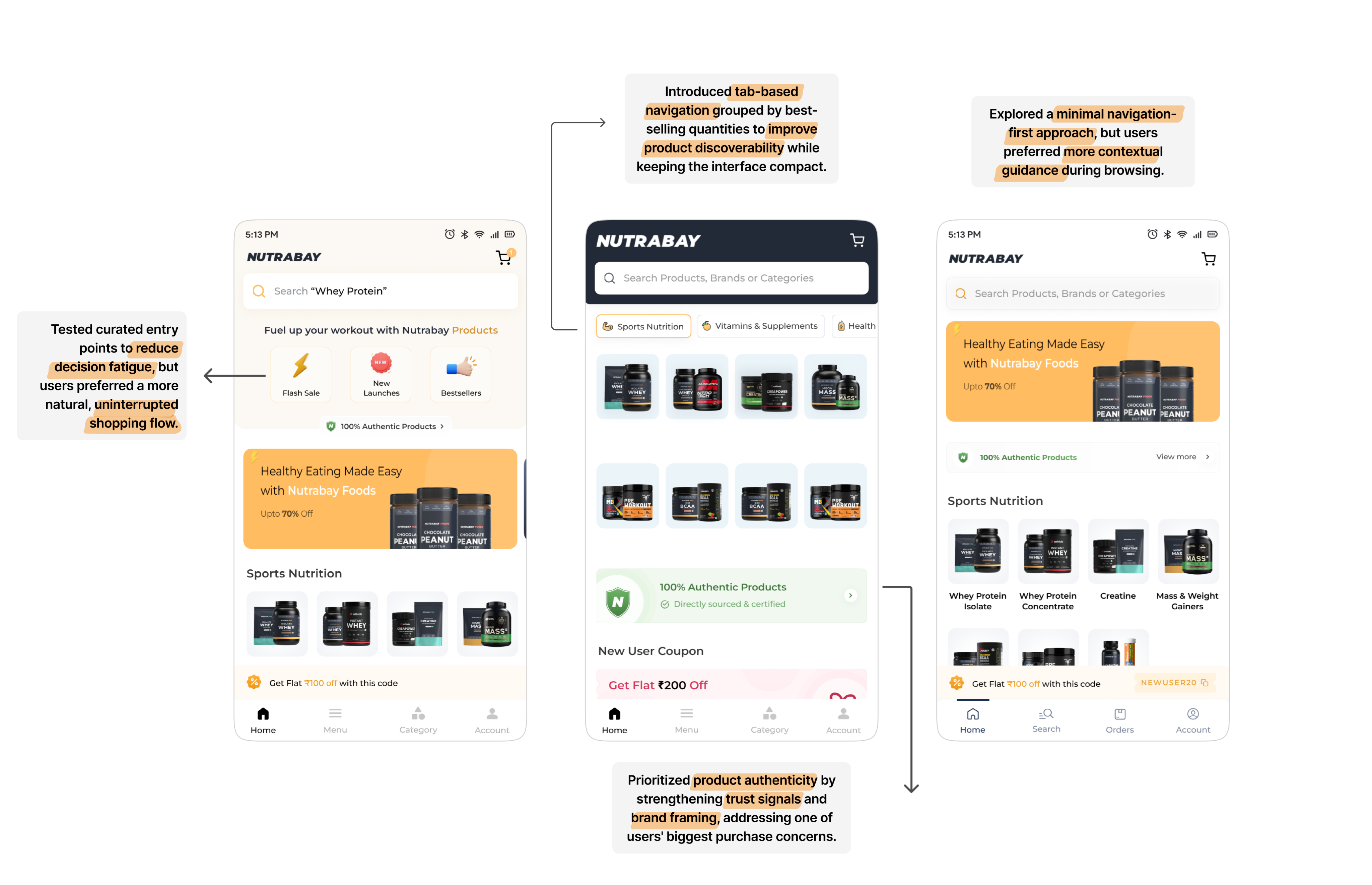
The goal-based section isn't just a design choice, it's infrastructure. The Page Manager means the homepage stays fresh without requiring a designer in the loop every time.
Search
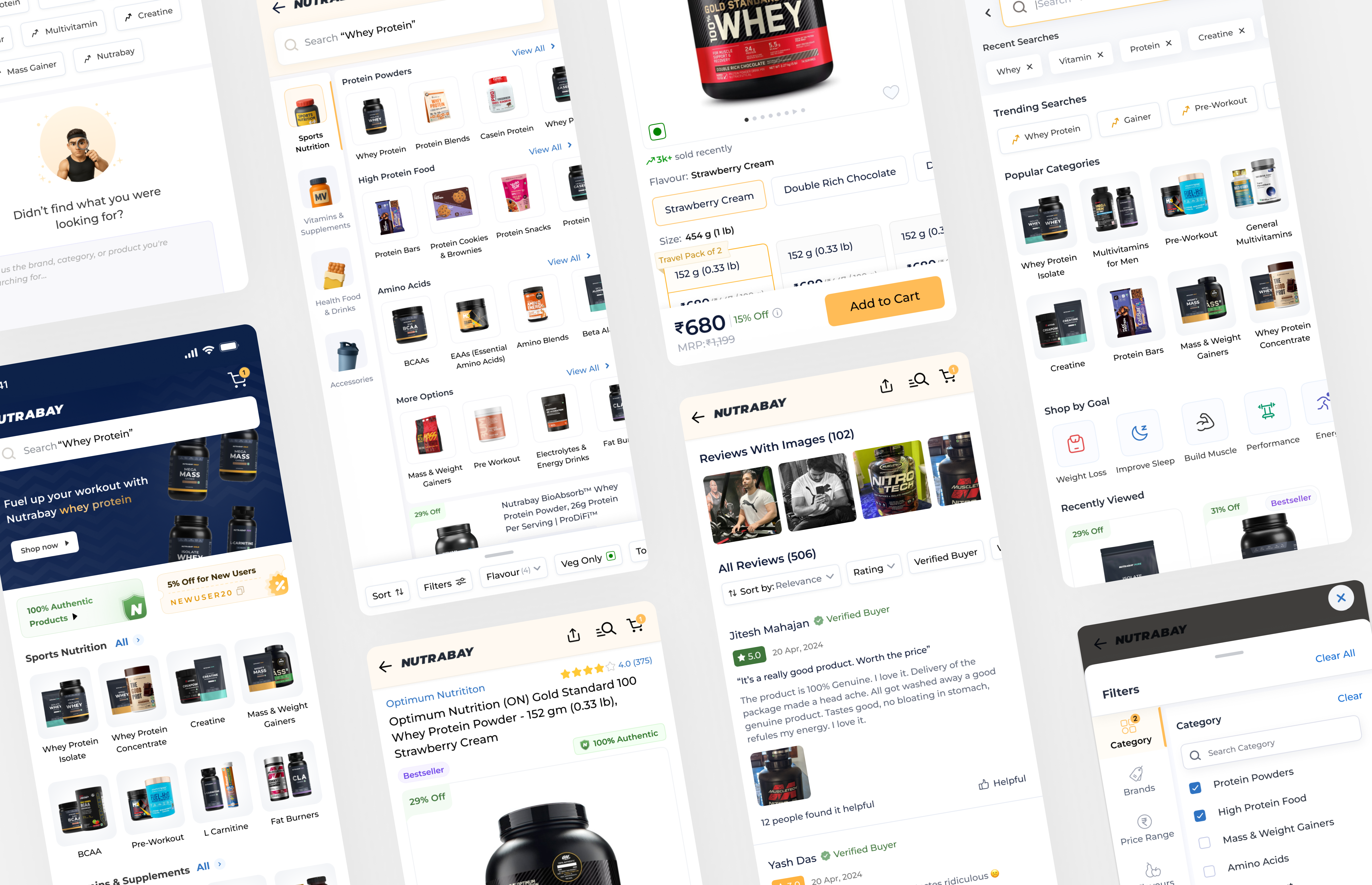
Merge product discovery into the search experience. On entry, users see category tiles and product previews, not a blank input. Typing surfaces actual products alongside suggestions, not just text matches. Users reach their product in fewer steps.
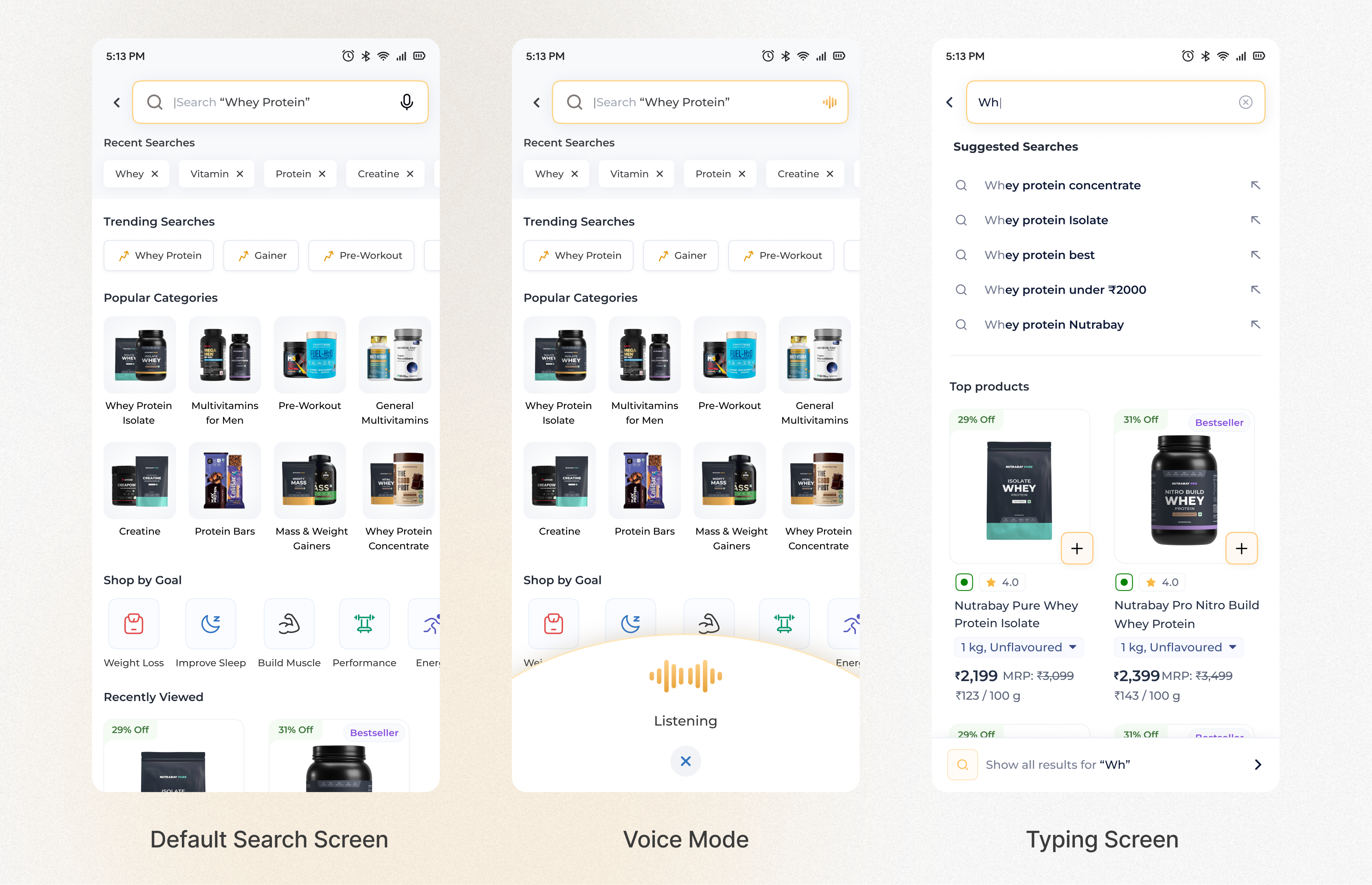
- Category navigation visible immediately on search entry, Sports Nutrition, Vitamins, Health Food, with subcategory tiles and product thumbnails. No typing required to start browsing.
- Typing now surfaces actual products in results, not just keyword suggestions. A user typing "whey" sees Whey Protein Concentrate, Whey Protein Isolate and Casein Protein as product cards, not just text links.
- Left-rail category navigation, persistent browsing alongside search results for users who want to explore.
- Recent searches surfaced for returning users, removing the need to recall and retype.
- Search term matching improved to handle synonyms and natural user language, reducing dead-end results.
Iterations
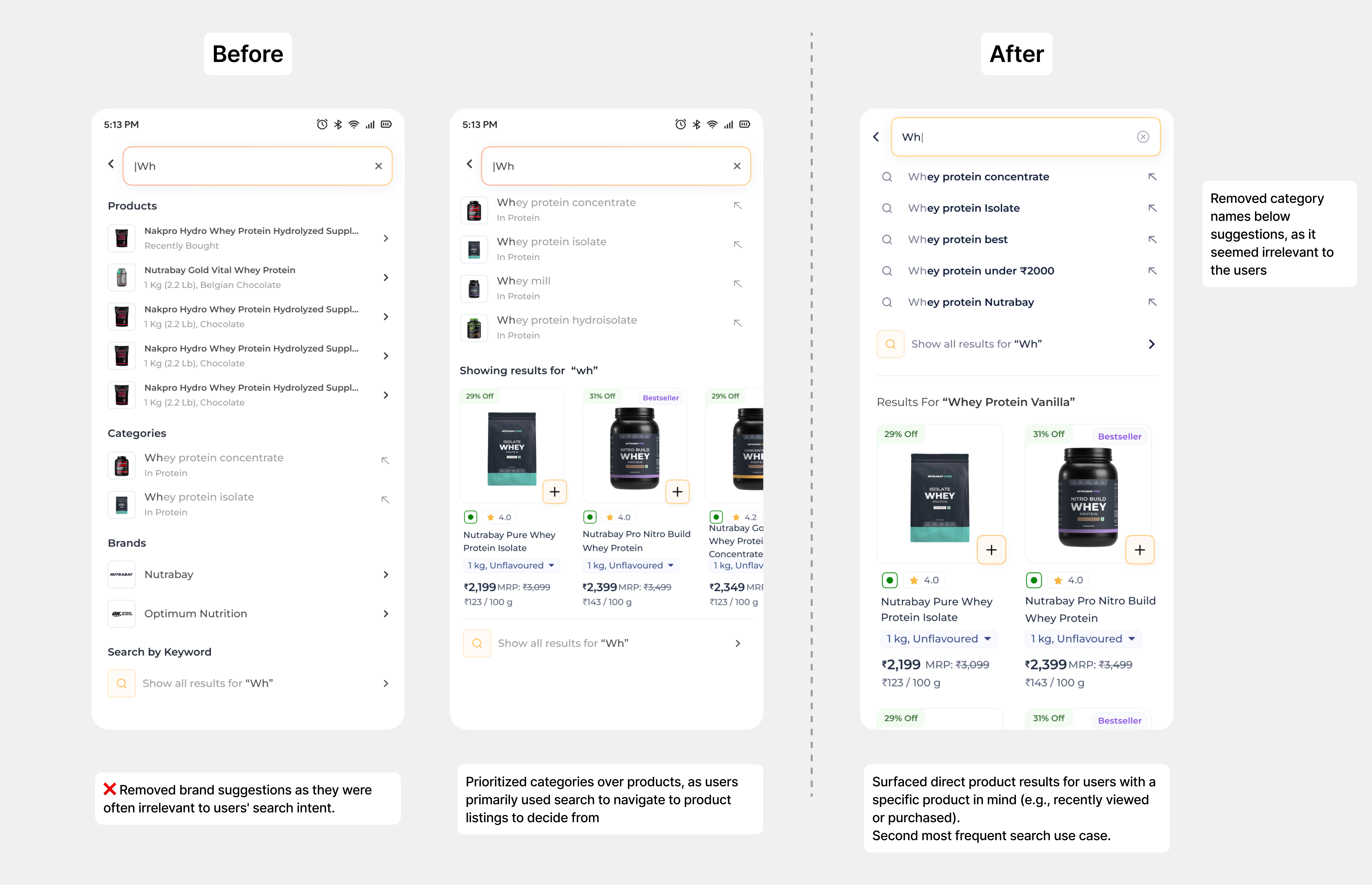
Search was the second-most used feature on the platform and a leading source of dead ends. The redesign made it the fastest route to any product, not just a fallback when navigation failed.
PLP
Display products at variant level, not parent level. Put comparison data on the card. Add decision nudges. Make filters discoverable. Add purchase history signals. Give users the control and information they need to decide from the listing, without leaving it.
Homepage → PLP conversion: 14% → 30% post-redesign.
Final screens and decisions
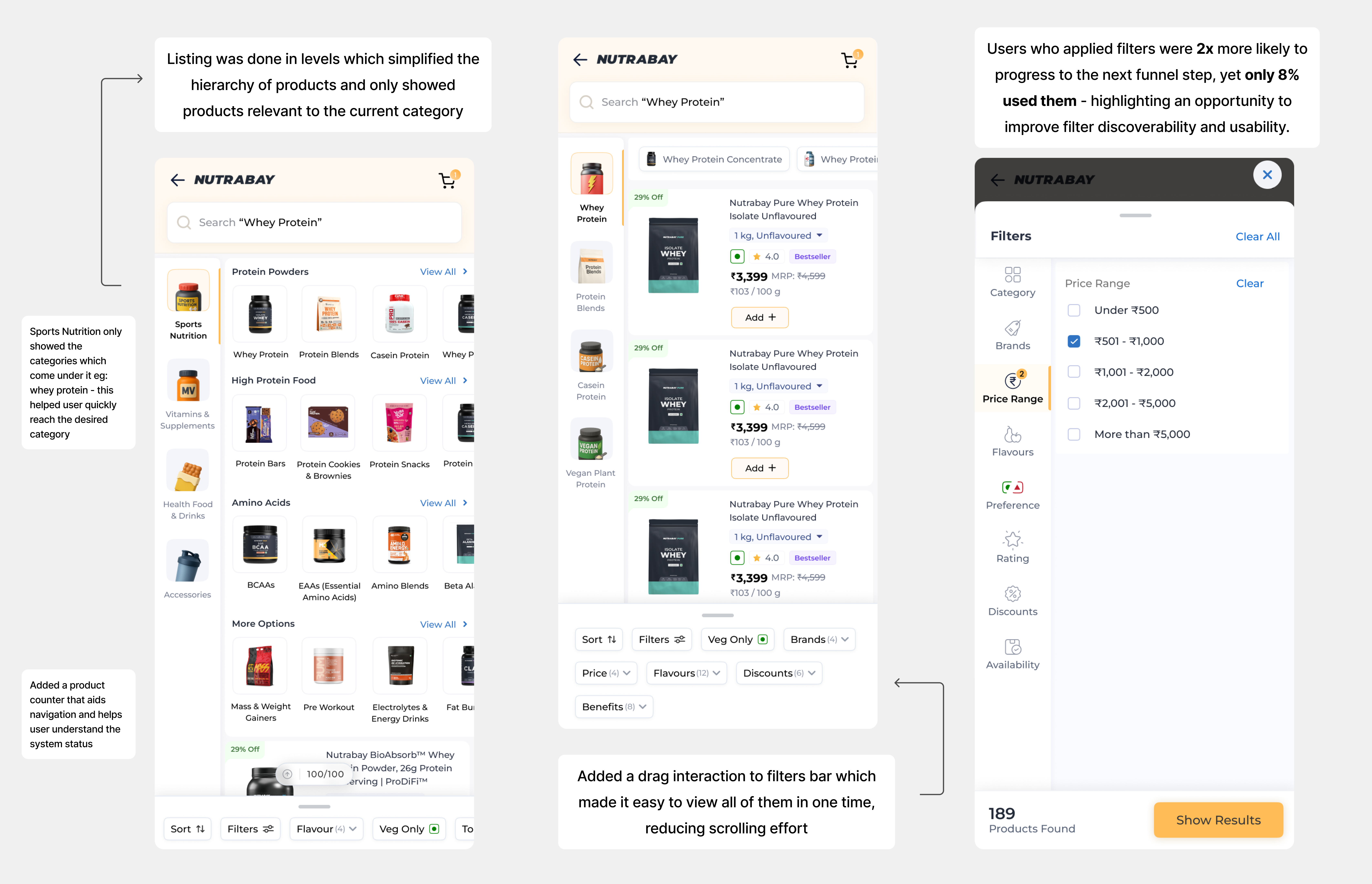
- Products now displayed at variant level, specific flavour, weight and price on the card. Eliminates the PLP to PDP to back to PDP loop session recordings documented.
- Price per 100g shown on the listing card, the comparison metric users were navigating to PDP to find.
- Per-variant pricing on swatches, compare flavours and weights without tapping each one.
- Direct add-to-cart on the listing card for single-variant products.
- Decision nudges added to product cards: "Bestseller," "Top Rated," "Sold X times," reducing decision paralysis and helping users choose confidently without reading full details (social proof and bandwagon effect).
- "Purchased before" tag on previously bought products, surfacing restock options at a glance, no recall required.
- Quick filter bar always visible: most-used filters, flavour, veg only, rating, sort, in a persistent action bar. Full filter panel available for deeper refinement.
- Filter conversion data: 50% of users who applied filters converted to the next page, making filter discoverability a direct conversion lever, not just a UX improvement.
- "Suggested for you" nudges added to the listing: the system can't know exactly what a user wants, but data on past purchases and browsing behaviour can aid the decision, surfacing relevant alternatives so search never dead-ends and comparison is faster.
Other screens
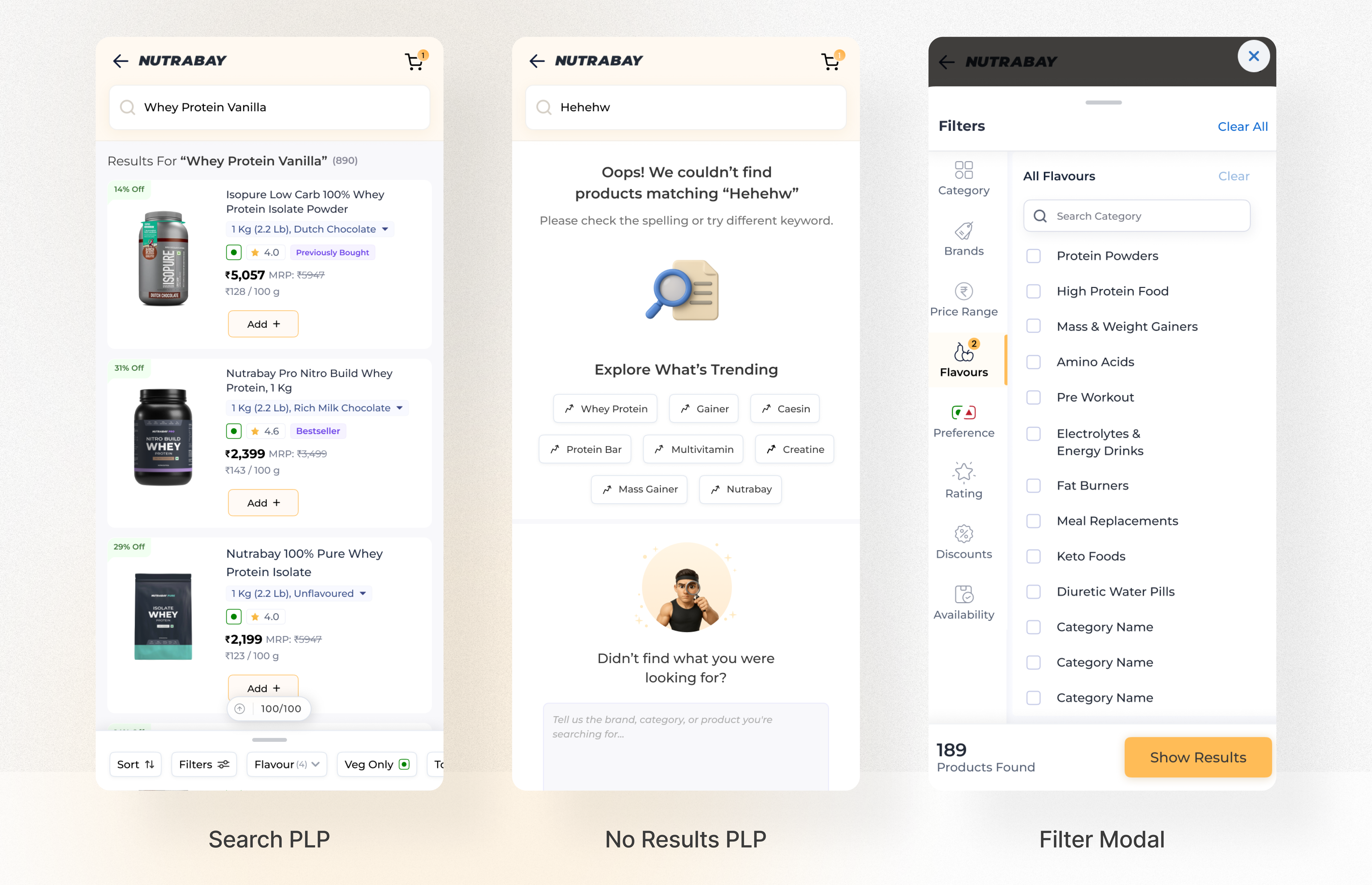
Designs discarded
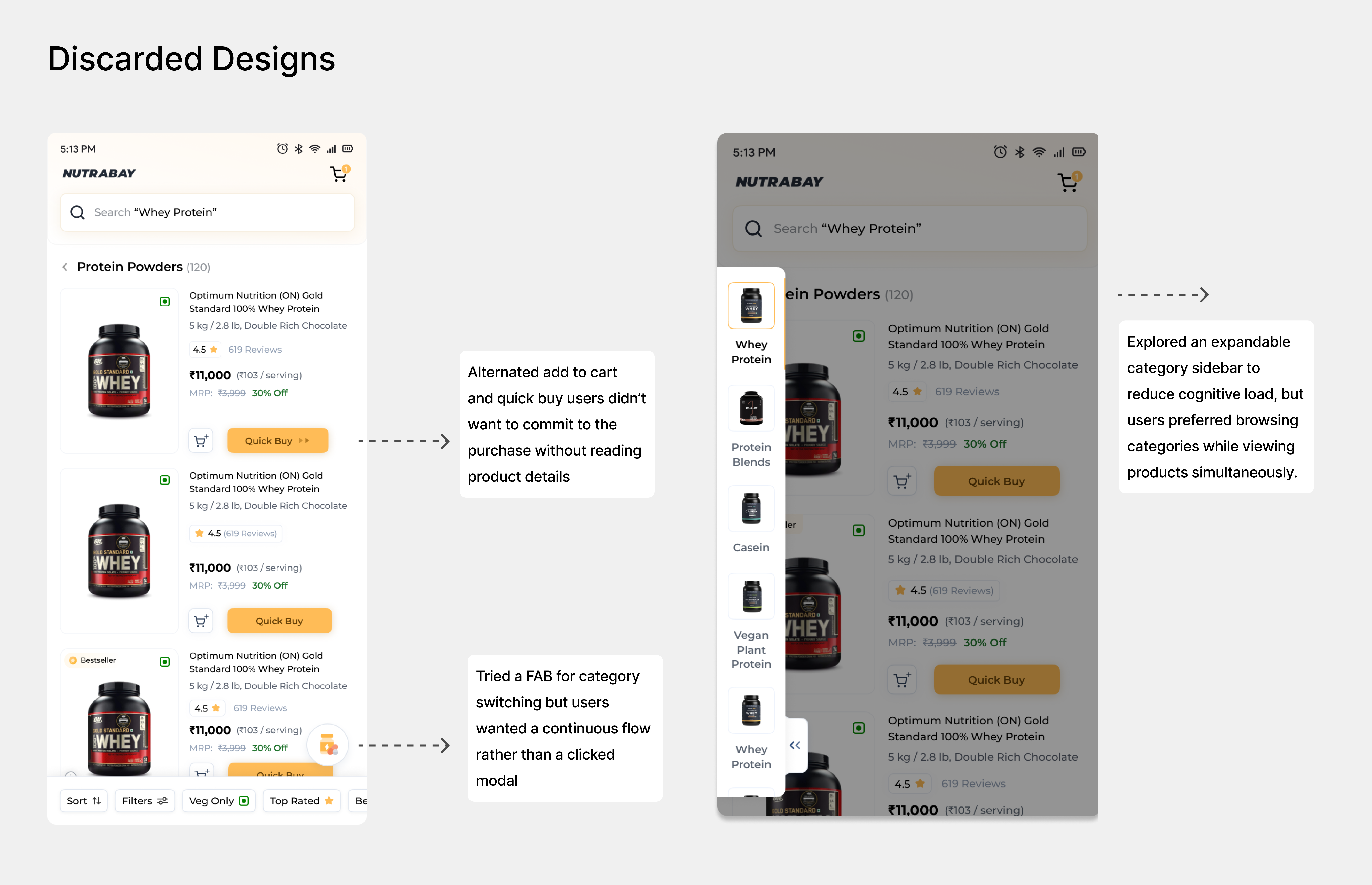
The old PLP required users to do the comparison work the interface should have been doing. Variant-level display, card-level pricing and decision nudges removed every step of that work.
PDP
Move the content that convinces users to buy into the first two folds. Surface social proof, nutrition stats, offers and trust signals before the drop-off point. Close dead ends. Make restocking frictionless. Use progressive disclosure to serve beginners and experts from the same page without overloading either.
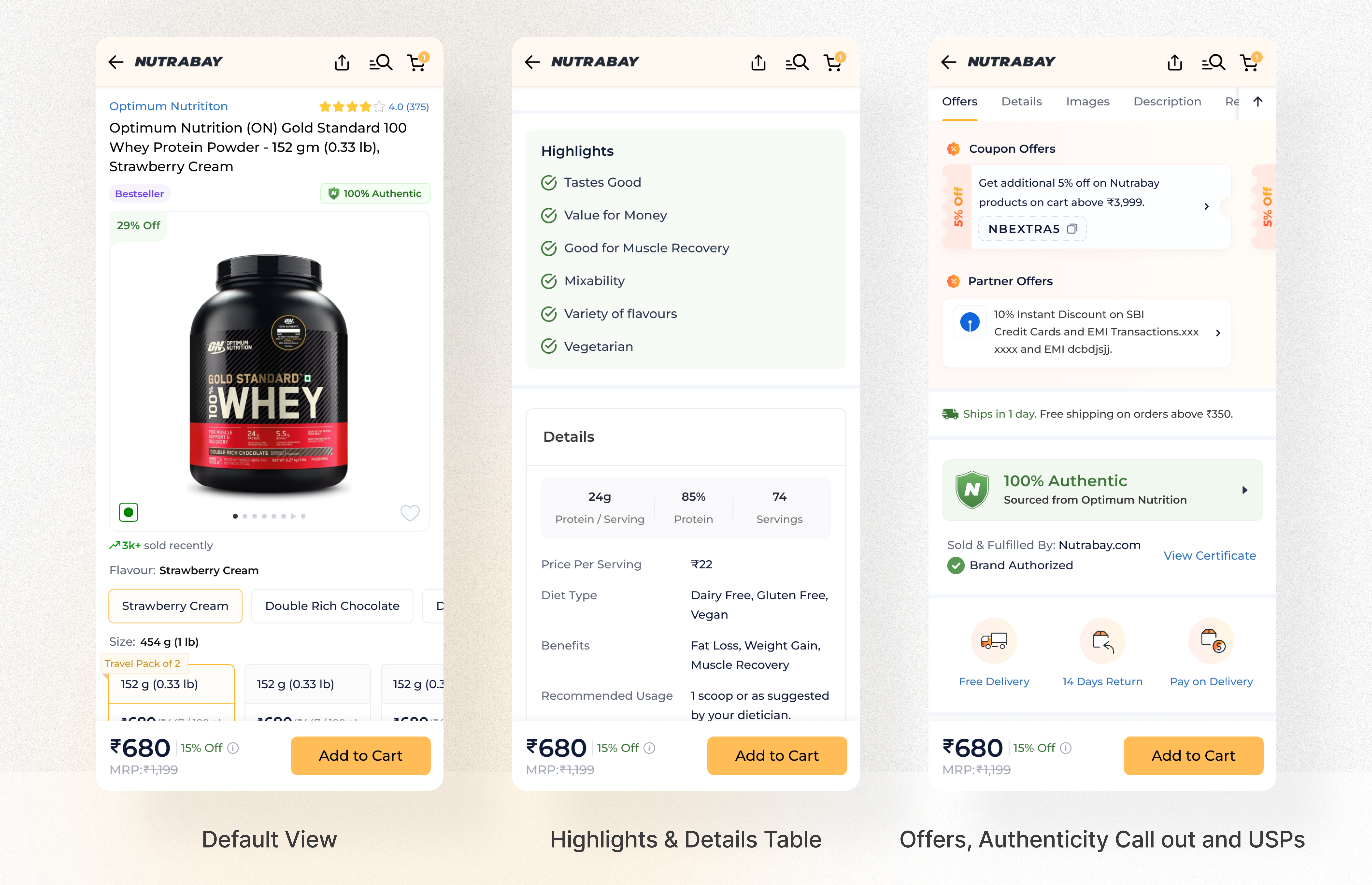
- Product highlights in the first fold, short benefit chips, Tastes Good, Muscle Recovery, Vegetarian, Value for Money, visible immediately without scrolling.
- Key nutrition stats surfaced as scannable figures in the first fold: 24g Protein per Serving, 85% Protein, 74 Servings, ₹22 per Serving.
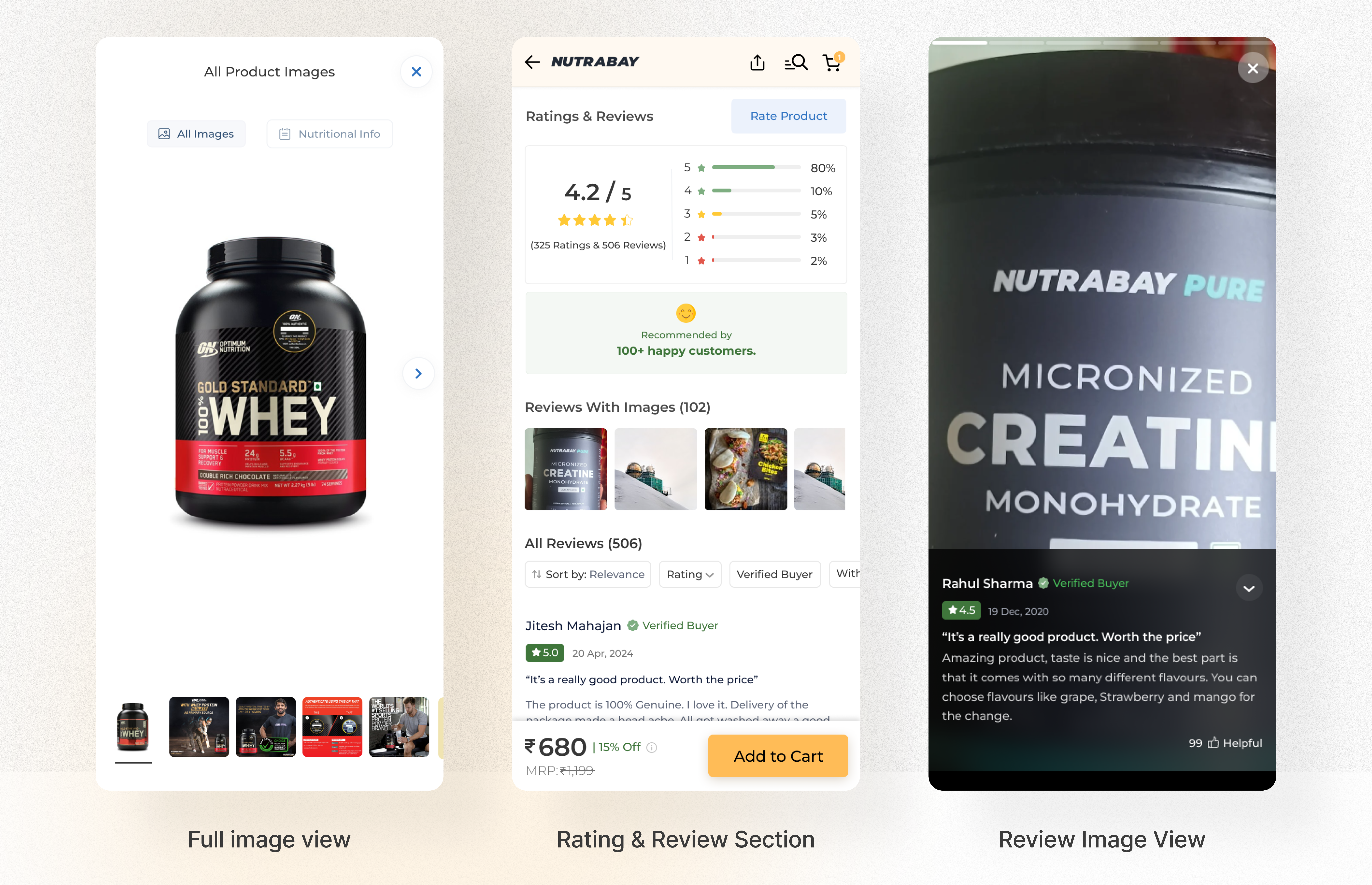
- Open image gallery, no tap-to-open. All product images and nutritional info browsable directly. Tab toggle: "All Images" and "Nutritional Info."
- Offers section redesigned, contrasting background, clear categories, unmissable placement, moved higher on the page.
- Per-variant pricing on swatches, all flavours and weights show price on the selector without tapping.
- "Notify Me" for out-of-stock swatches, a dead end converted to a retention moment.
- Lab reports and authenticity certificates on the page, directly answering the top NPS trust concern.
- Sticky navigation bar, scroll-to-section buttons for nutrition, reviews, offers and specifications.
- Last purchased variant pre-selected for returning users, frictionless restock, no re-selection required (Peak-End Rule).
- Reviews redesigned: "Reviews With Images" section at top, photo-first layout, colour-coded ratings, keyword tags from review text, simplified sorting, reduced cognitive load in the review card hierarchy.
- Full-view review image, user photo at full size with review text as secondary, matching how users were engaging with this content in recordings.
The PDP had the right content. It was in the wrong order. Moving it up, based on exactly where heatmaps showed users were, is what drove the 21% conversion improvement.
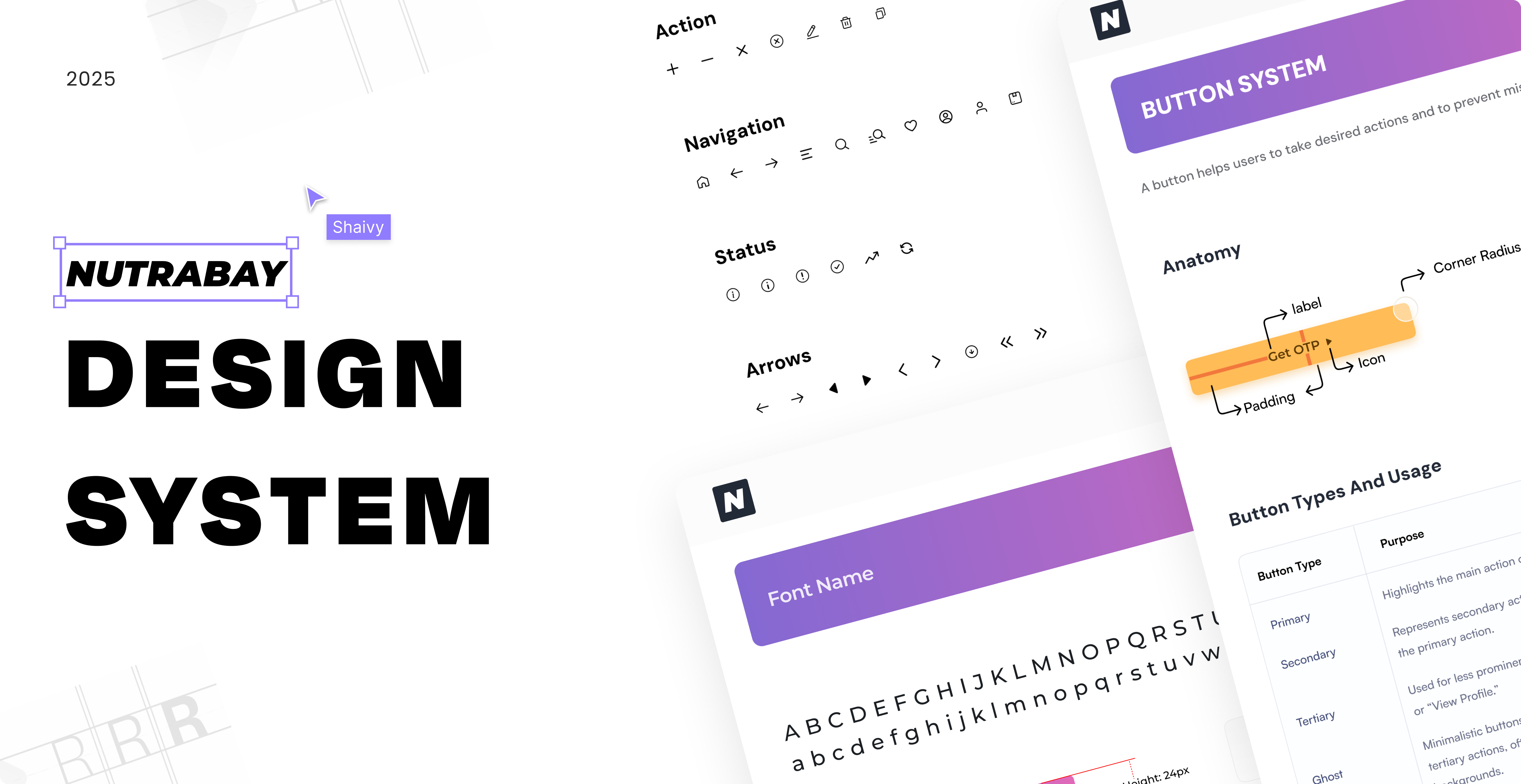
Thinking beyond screens, a shared design system.
One of the most significant outcomes of this project was not a screen. Across the homepage, PLP and PDP, the same UI components, product cards, category tiles, filter chips, rating displays, were being designed and built differently each time, serving the same function with different implementations. This created inconsistency for users and wasted build time for engineering.
As part of this redesign, a component library was established, defining card types that could be used across any page where the same purpose needed to be served. A product card on the homepage, on the PLP and in search results now follows the same structure, the same hierarchy and the same interaction model. Consistent components reduce cognitive load, users who recognise a pattern from one part of the app don't have to relearn it on another page (Jakob's Law). Every new feature built on Nutrabay now starts from a shared system, not from scratch.
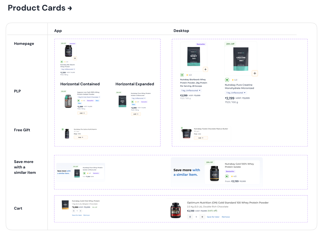
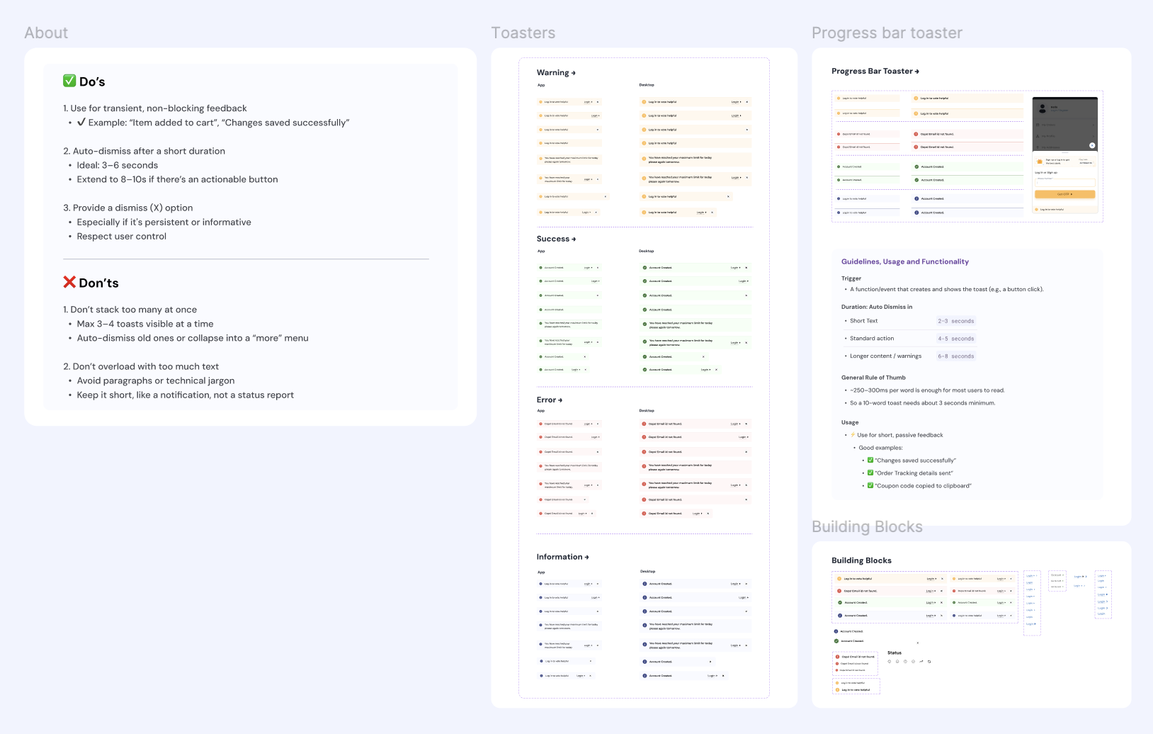
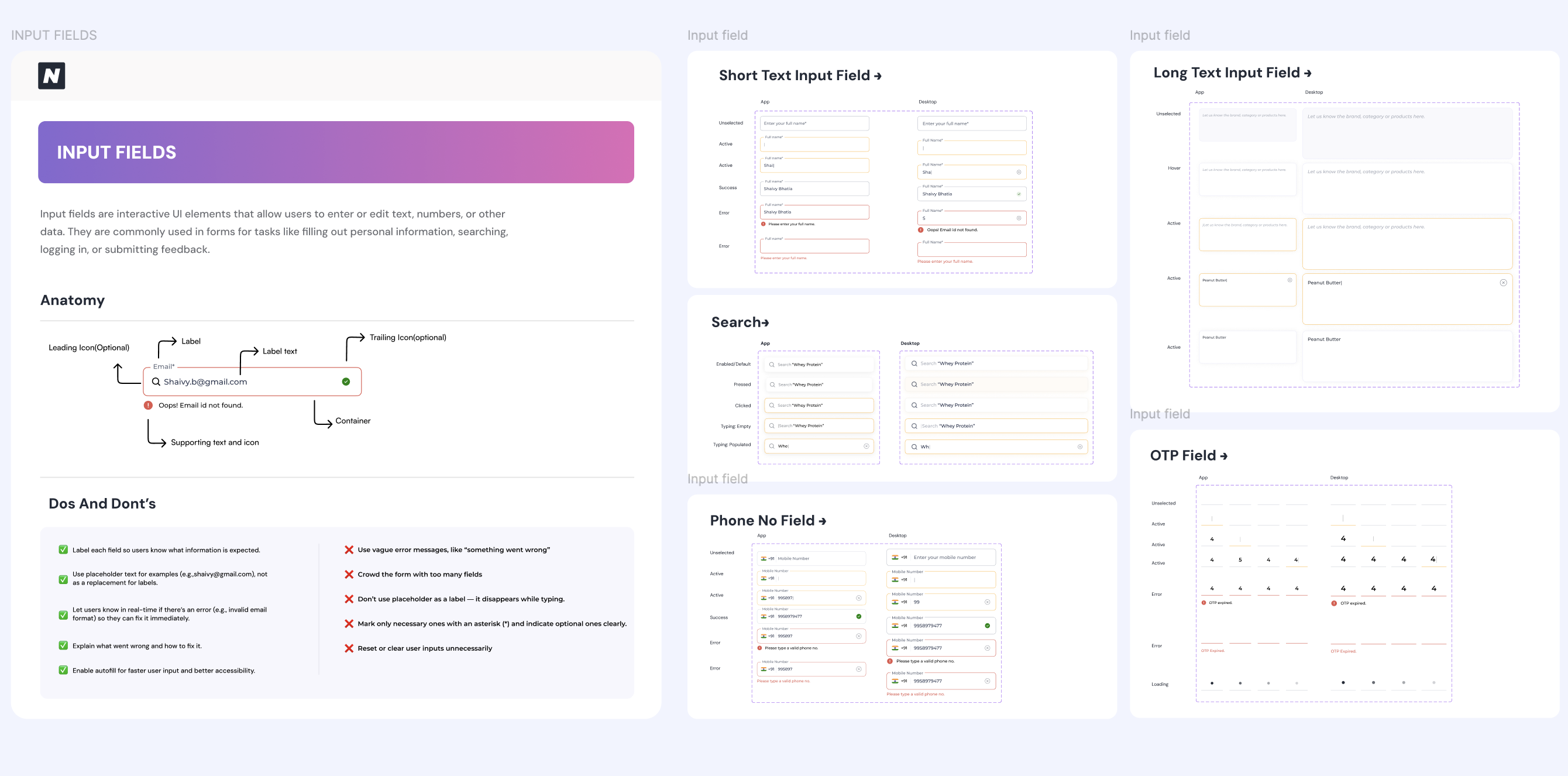
Design systems are a form of product infrastructure. The card component built for PLP is the same card that appears in search results and on the homepage. One design decision, deployed everywhere.
Designed for app, web and desktop.
Most users were browsing on the app, so that's where the redesign was optimised first. But the same system had to hold up on the mobile web app and the desktop site too, scaling the same components, hierarchy and logic to a wider viewport without feeling like a different product.
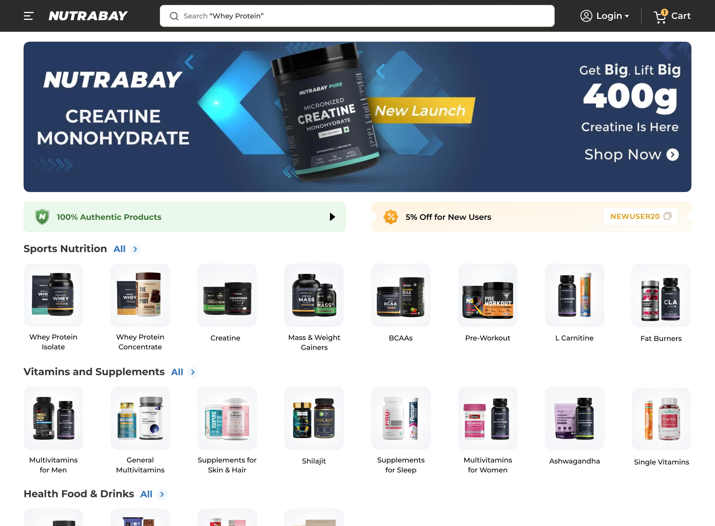
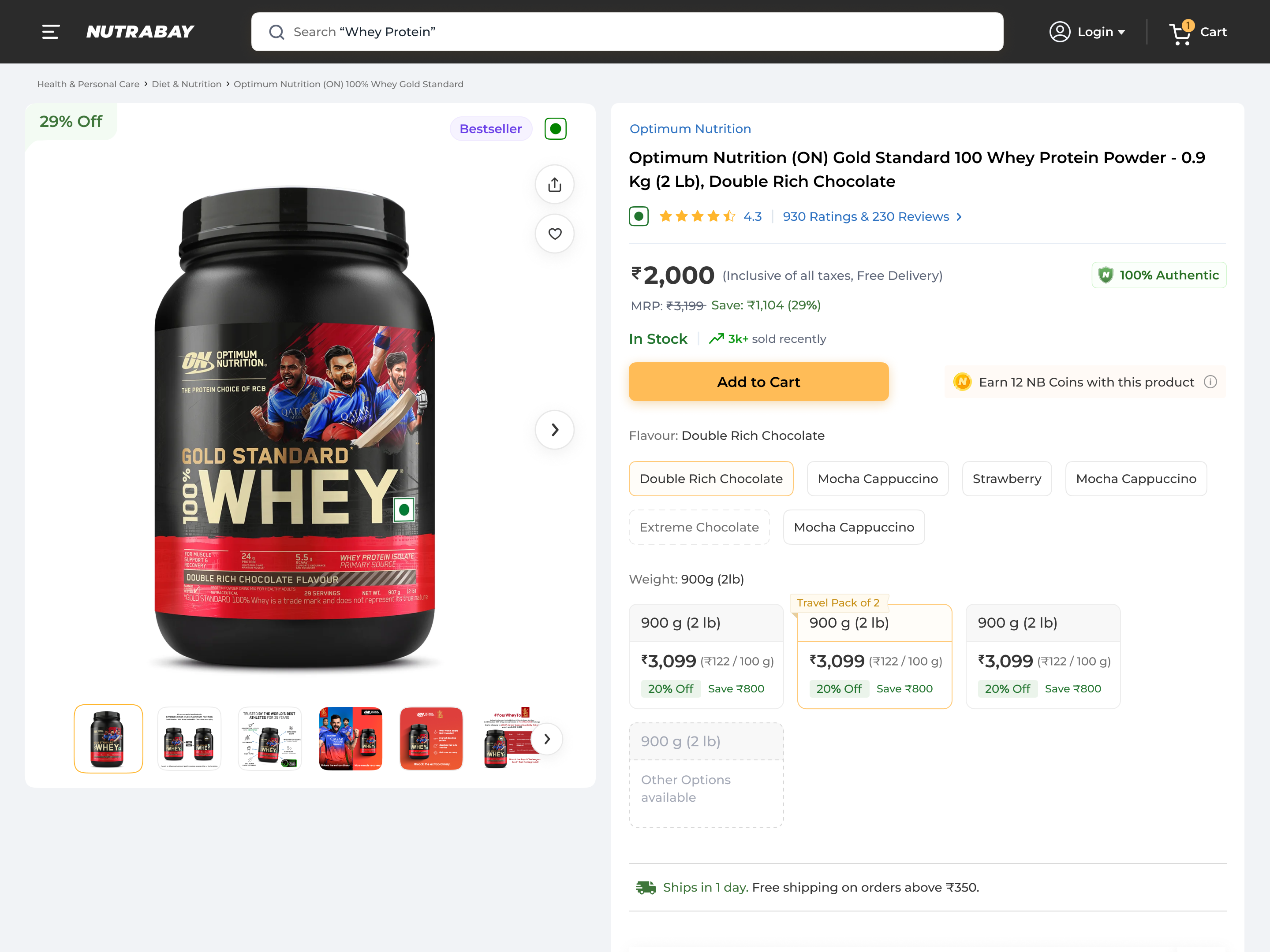
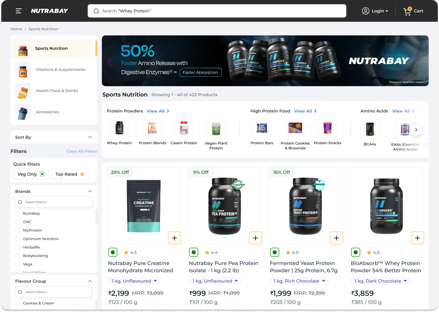
The product, in action.
How I made it happen: working in close collaboration with product managers and the development team, I ran several rounds of user acceptance testing to keep the shipped experience true to what we'd agreed in design reviews, and partnered with engineering throughout to validate what was feasible within the team's technical constraints.
What I'd carry into the next redesign.
The project brief was a homepage redesign. Session recordings, heatmap data and funnel analysis showed us the homepage was not the most costly point of friction, it was one of many. Drop-off was happening at every step, and with each step the funnel lost more users. Expanding scope required a data argument to the PM. The recordings and the numbers made it straightforward. Good UX work often means redefining the problem before solving it, and having the data to back that redefinition.
The most consistent pattern across all four pages was that users were being asked to hold in memory things the system should have tracked: the product they last bought, the session they started yesterday, the flavour price they checked on the previous card, the variant they always select. Each is a small friction. Together they describe a platform that doesn't know you, even if you've been buying there for two years. Every recognition-over-recall change we made, recent purchases, session continuity, pre-selected variants, purchased-before tags, reduced cognitive load and shortened the distance between intent and action (Nielsen's Heuristic #6, Miller's Law).
The Page Manager, the backend module that lets the marketing and merchandising teams update goal-based homepage sections without engineering involvement, was not in the original brief. It came from a design conversation: if we build this section as a static design, it will be outdated in a month. So we designed the structure and worked with engineering to build the configurability. That decision is what separates a homepage that looks good at launch from a homepage that stays relevant six months later. Designing systems, not just screens, is how design creates lasting impact.
