
Back
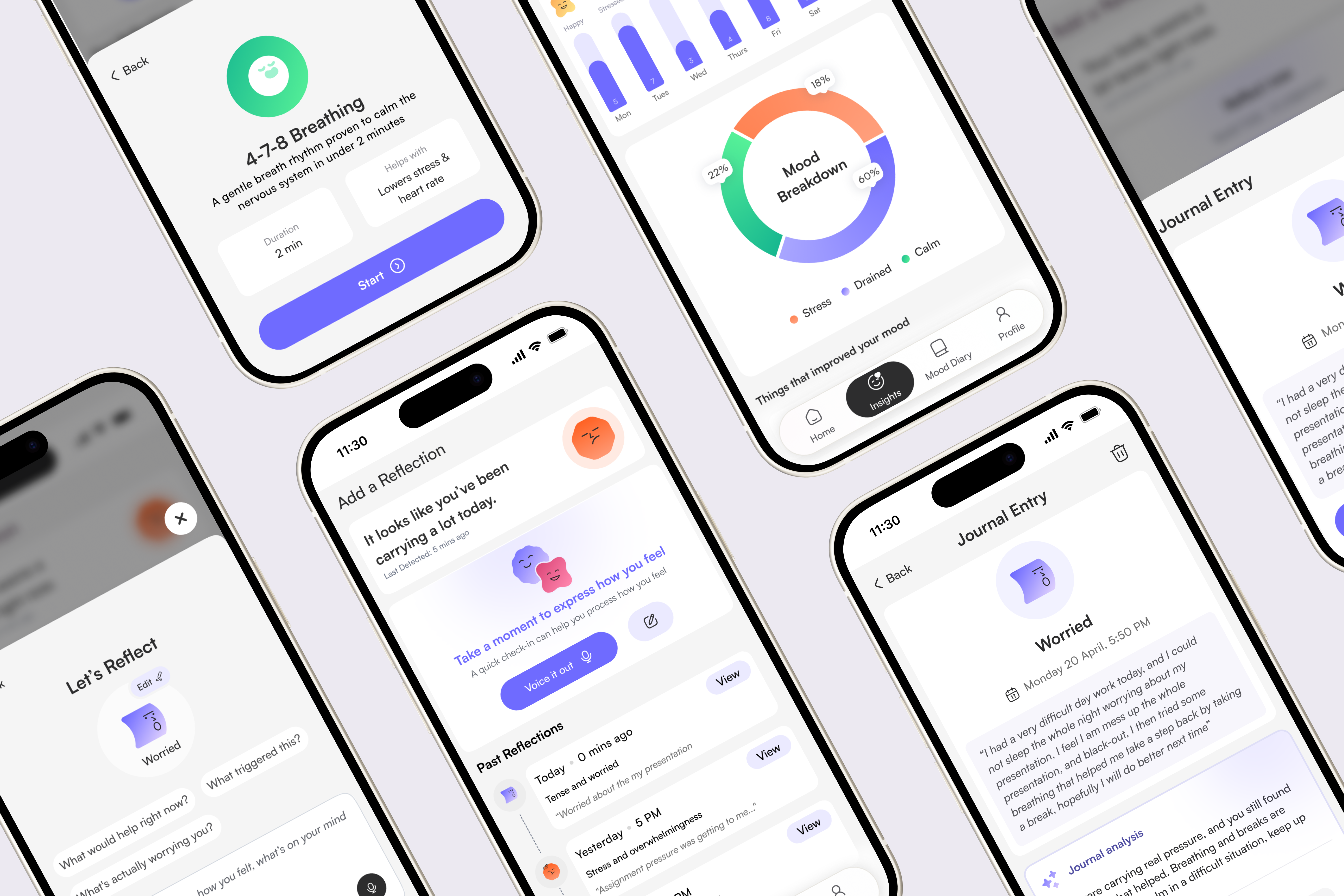
MoodMate companion app — home, insights and journal-entry screens UX Design Awards, nominated 2026 Watch product video
Product Design Wearable AI UX Research

MoodMate

An AI emotional-support wearable that senses stress on the body and helps in the moment, no screen, no logging, no effort when you have the least to give.

My role Lead Product Designer, research, IxD & prototyping
Team Solo, self-directed end‑to‑end
Process Lean UX (Think · Make · Check)
Duration 8 weeks · concept → tested prototype
Skip to the screens
Why this project

I picked this topic because I kept seeing it around me, people quietly carrying stress with no real outlet for it, and for years I felt that gap myself, a lack of anything that met people where they actually were. What changed my mind about what was possible was sensing technology, wearables that could read the body directly. That's what gave me the idea that support didn't have to start with someone opening an app.

What is MoodMate

A companion you wear, not one you watch.

MoodMate is a slim haptic bracelet paired with a gentle AI app. The bracelet senses the physical signs of rising stress, heart-rate variability, skin response, and answers with a quiet pulse that guides your breathing back down. No notification to dismiss, no app to unlock, no mood to type out. The app is where the moment becomes a pattern later, on your terms.

It started from a sharper question than “another wellbeing app”: how do you offer comfort that meets someone exactly where they are, on the body, in the moment, and only when it’s wanted?

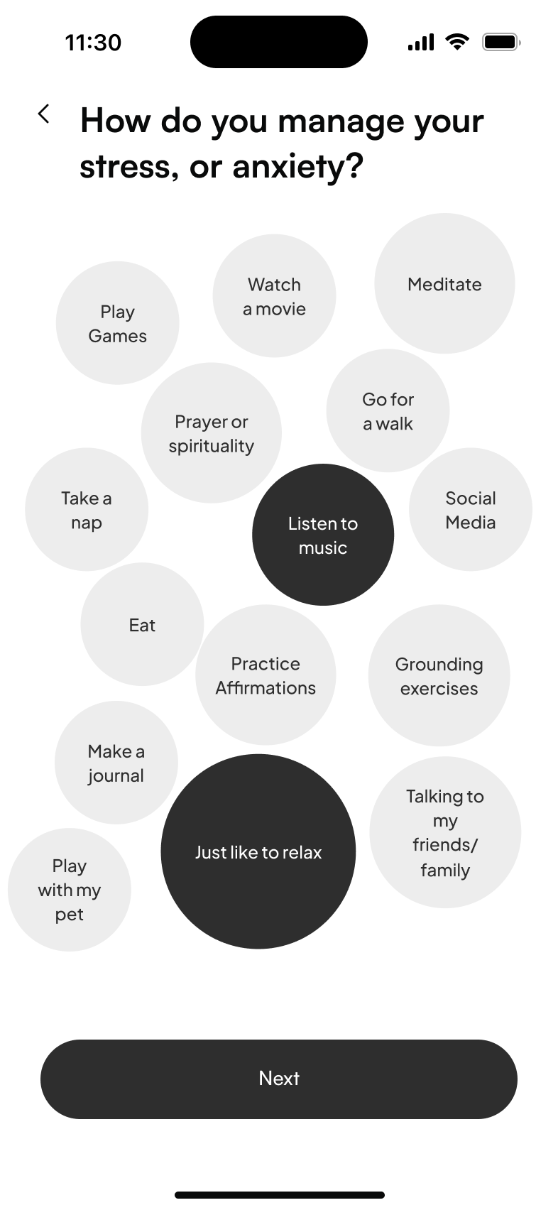
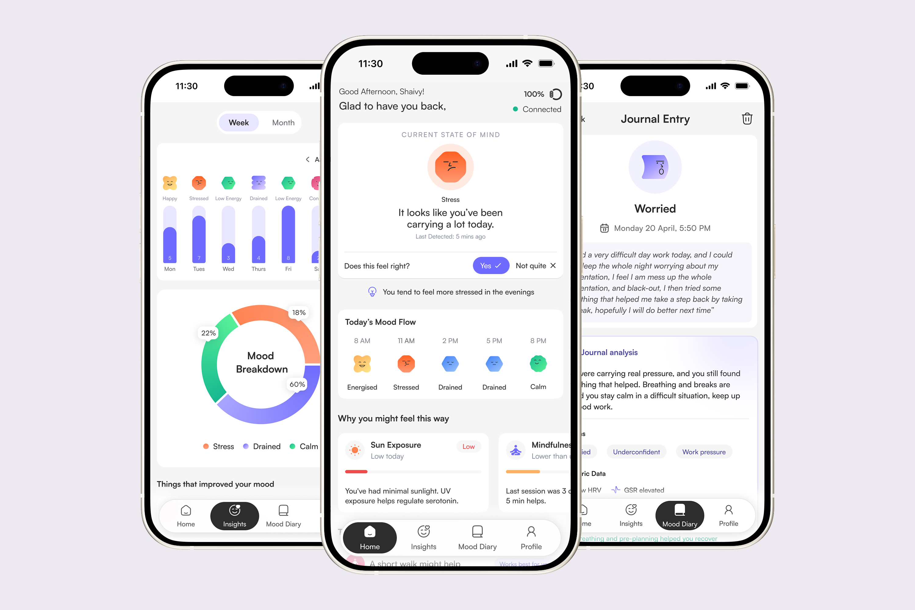
MoodMate app screens, breathing exercise, mood diary, insights and journal entry
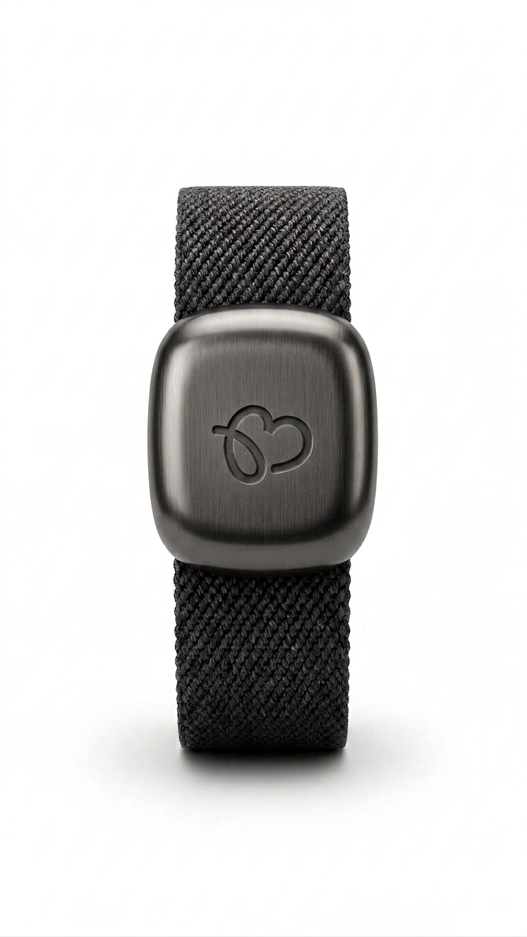
MoodMate band — graphite colourway, front view
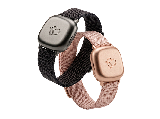
MoodMate band — graphite and rose-gold colourways

The MoodMate band, a slim haptic wearable in graphite and rose-gold, sensing on the wrist instead of demanding a screen.

Secondary research

Understanding the problem.

Mental health is a widespread issue

1 in 6
adults experience a mental health problem, and over half report feeling high stress or anxiety.
Lewis & Stiebahl, 2025
26%
of young adults are unable to perform daily tasks due to anxiety.
Mental Health Foundation, 2023

Why this problem

Emotional distress is often under-identified and self-unreported
Many international students don't actively express or recognise emotional decline early, leading to delayed coping and a growing psychological burden over time.
Qmu.ac.uk, 2023b
Lower cognitive resilience among the younger generation
Reduced cognitive resilience in Gen-z's and post-Gen Z is driving greater reliance on external systems for emotional regulation.
Nakhostin-Khayyat et al., 2024

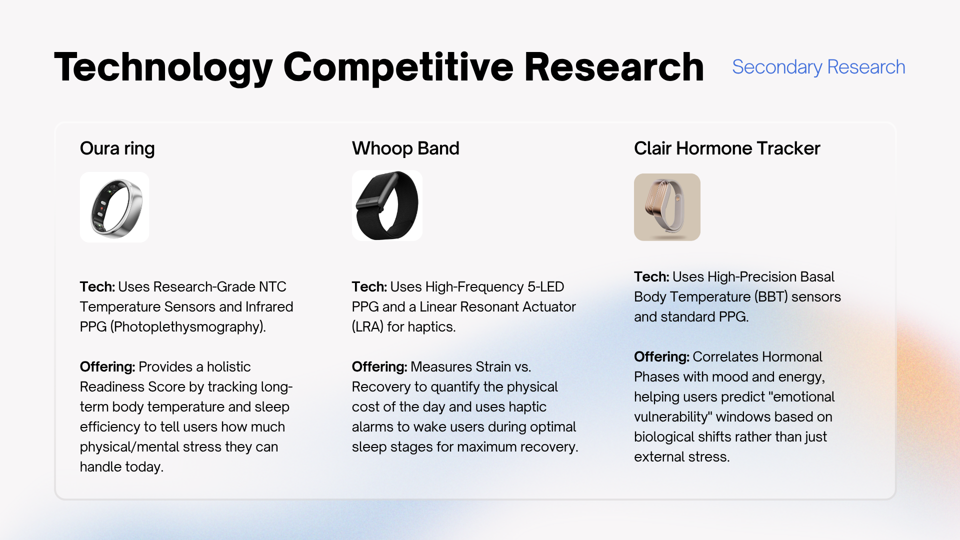
Competitor analysis

The gap no product fills
Key insights

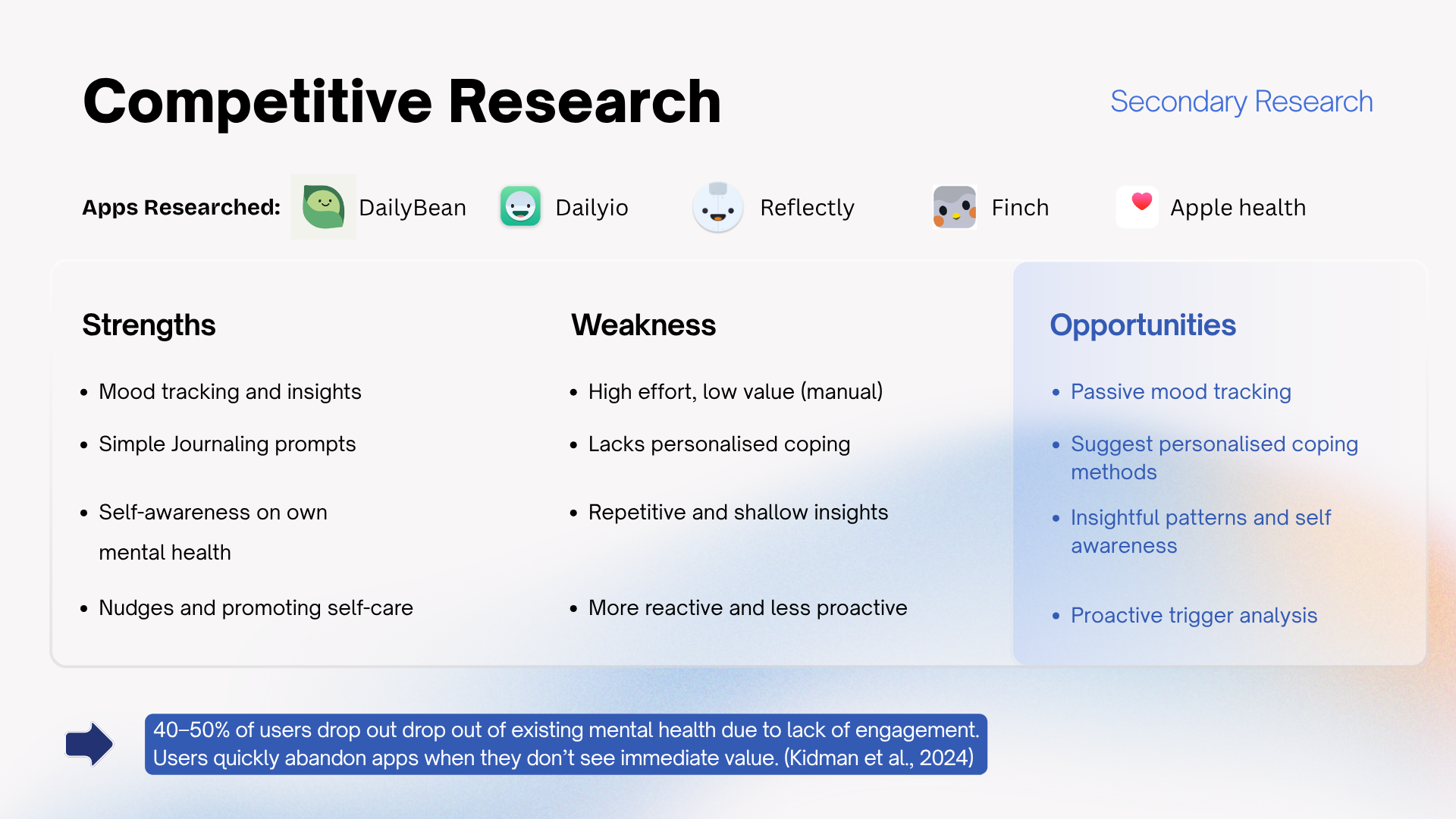
Most existing apps rely on manual tracking and mood entries that users continually forget, producing inconsistent data while demanding effortful journaling. Their insights stay static and generic, never personalised to the individual's own data.

Design decision
Sense stress passively on the wrist, never depend on the user logging a mood.
Passive sensing
Primary research

Then I went straight to the people.

Desk research set the brief; primary research proved it. A survey to size the problem, then eight depth interviews to understand the behaviour underneath the numbers.

Survey · quantitative sizing 8 depth interviews Mental-model exercises

Key findings from the survey

75%
Found passive detection helpful or very helpful
Core product premise validated
48%
Only sometimes know the reason behind their mood
Detection gap confirmed
25%
Actively suppress their feelings
Strengthened the case for passive sensing

What the interviews surfaced, and what each changed

01 Insight

All 8 rejected manual mood logging as impractical, they couldn’t identify their emotional state in the moment.

Design implication

Passive biometric detection became non-negotiable. No logging anywhere in the app, not even optional.

→ Zero mood logging
02 Insight

Emotional suppression was the dominant pattern, pushing feelings aside rather than addressing them.

Design implication

Homepage surfaces the detected state to spark an internal dialogue with the self, then offers directional prompts to address the reasons behind it.

→ Internal dialogue + directional prompts
03 Insight

Distraction through entertainment and music dominated coping, but participants knew it wasn’t helping long-term.

Design implication

The coping library leads with adaptive strategies (walking, breathing, reflection) and labels why each works, not just what to do.

→ Coping library
04 Insight

Mental-model exercise: users associate emotional processing with talking, “letting it out”, not structured written input.

Design implication

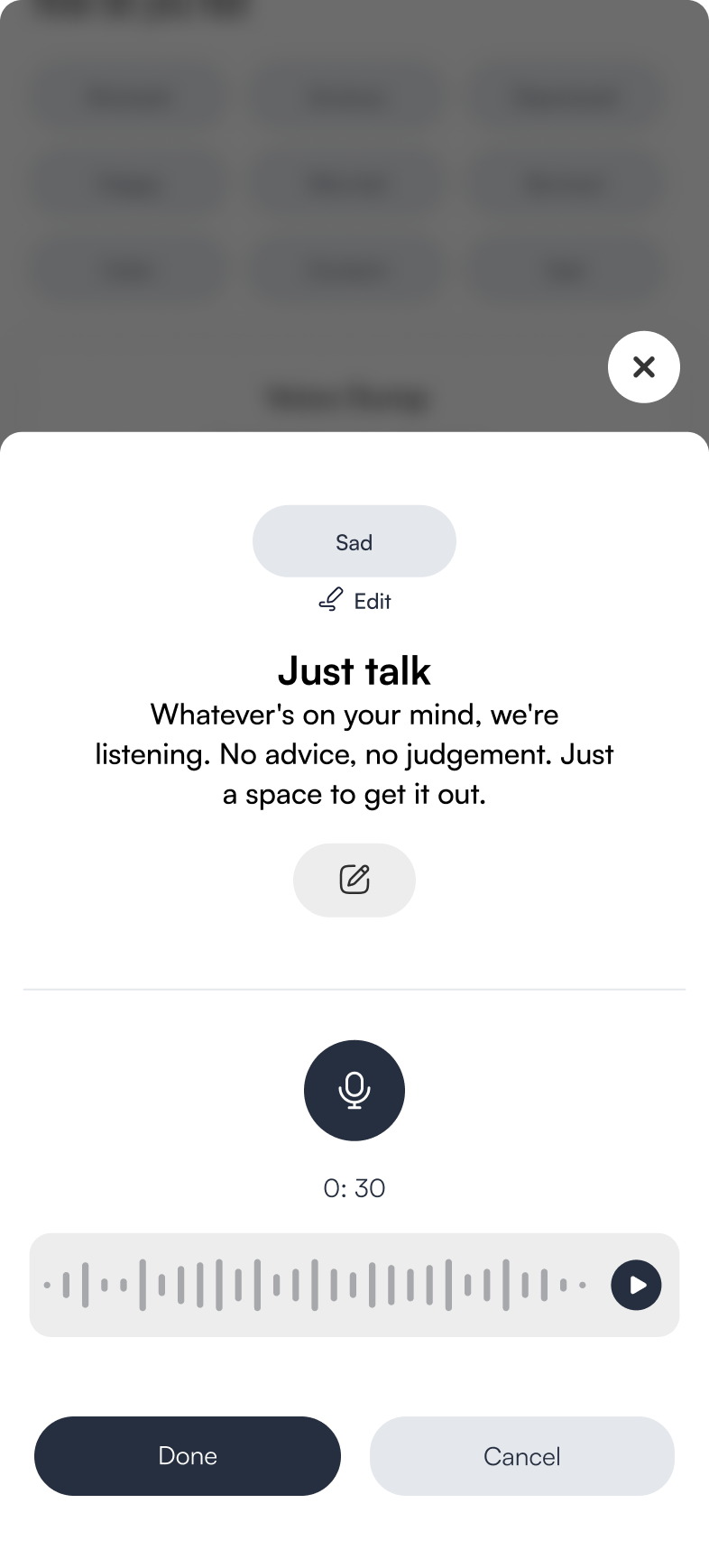
Voice Dump, prompt-guided voice input that processes emotion without requiring written articulation.

→ Voice Dump feature

Expert interview findings

Alongside the student interviews, I spoke with a mental-health practitioner to sanity-check the model behind the product.

01

Emotional numbness was identified as a significant and underdetected warning sign, a state in which students disengage from their feelings entirely, which self-report tools are structurally unable to capture.

02

The expert emphasised that awareness of one's emotional state is the essential first step toward resolving it; without recognition, no coping strategy can be activated, and distress continues to accumulate beneath the surface.

03

Voicing emotions aloud was highlighted as a particularly effective form of processing, consistent with CBT theory, which establishes that externalising and articulating a felt experience reduces its intensity, interrupts rumination, and restores a degree of cognitive control, directly informing MoodMate's Voice Dump feature.

04

The expert described emotional escalation as following a bell-curve pattern: stress builds gradually from a baseline, reaches a peak, and then subsides. Critically, if triggers are identified and intervention is delivered before the peak is reached, the curve can be flattened.

The deeper need underneath it all

Users wanted a tool that understands them, and gives them a way to reflect and actually see themselves.

Across interviews, people showed a striking lack of self-empathy, quick to dismiss their own feelings. That pointed to a whole surface area of the product: a space designed to help users understand themselves, not just manage a moment.
Thematic analysis

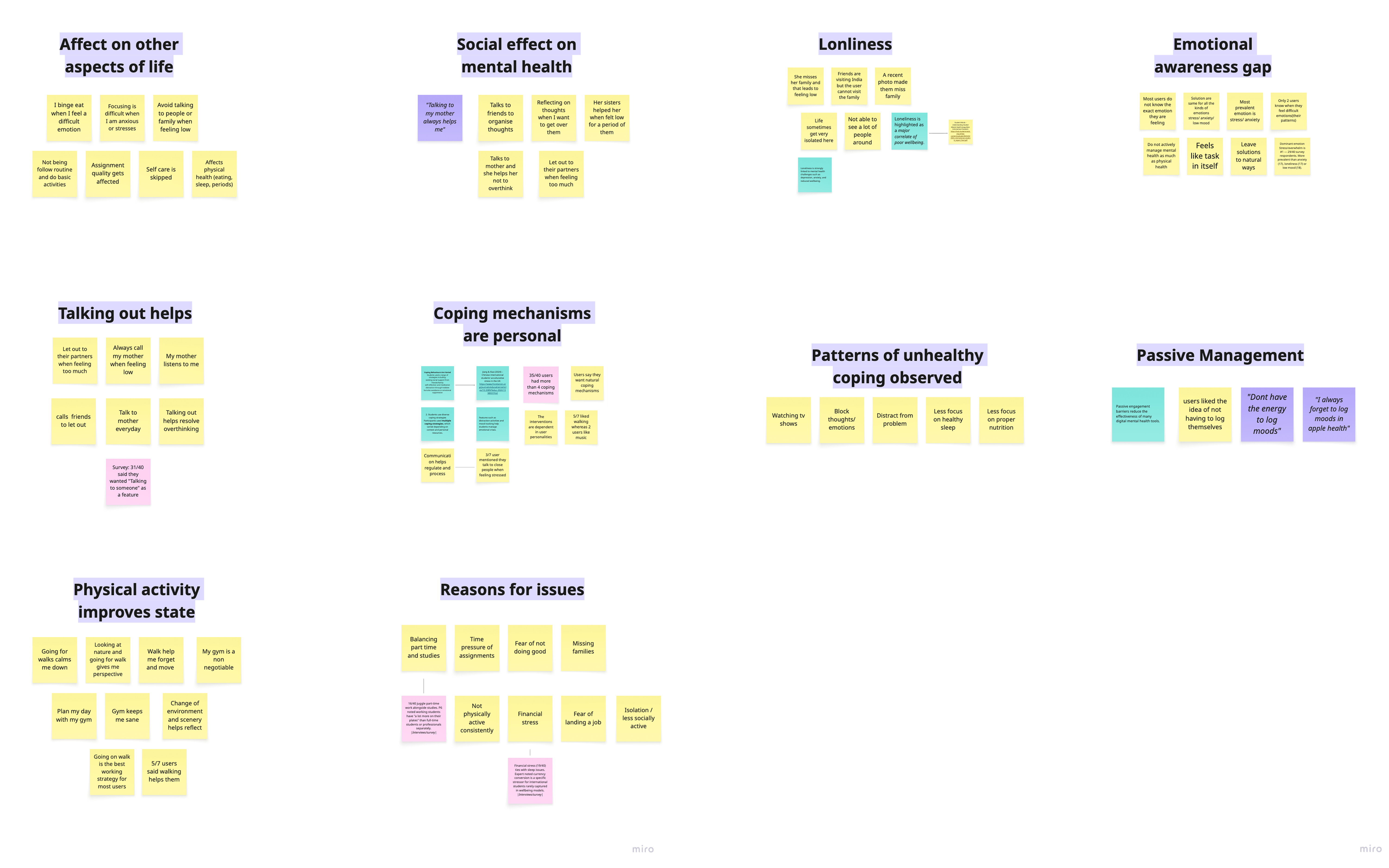
Five themes from the UX findings.

Coding the survey and interview data surfaced five recurring themes. Each one set a direction for the product.

→
Emotional unawareness

Students frequently could not identify their own emotional states or their underlying causes.

→
Suppression as a default

Distraction and avoidance dominated as coping responses, with adaptive strategies rarely activated under pressure.

→
Rejection of manual logging

Self-report tools were experienced as burdensome and impractical at the moments of highest need.

→
Need for personalisation

Students wanted tools that understood their individual patterns rather than offering generic content.

→
Warmth over clinical framing

A human, non-judgmental tone was consistently preferred over therapeutic or prescriptive language.

Thematic analysis board — affinity mapping of interview and survey data, clustered into five themes

Affinity mapping of interview and survey data, clustered into the five themes above.

Understanding the problem

One core failure, branching into four gaps.

Every tool broke the same way, it asked for effort at the moment a person had none. That single failure splits into four gaps.

The core problem
Existing tools demand effort at the exact moment a person has none.
Gap 01
Detection
Apps wait to be opened. By the time someone logs distress, the moment has already passed.
Gap 02
Timing
Daily reminders fire on a schedule, not when stress actually spikes at 2pm.
Gap 03
Activation
Even good tools need unlocking, tapping, reading, friction when capacity is lowest.
Gap 04
Pattern
One-off check-ins never connect into the longer story of what sets a person off.
The design challenge

How might we help students become aware of emotional changes before stress escalates, and effortlessly improve their mood in the exact moment they're least likely to engage?

Who I designed for

Students and young professionals.

The target participants were university students and early-career young professionals, largely Gen Z, who feel stress often but rarely have the bandwidth to actively manage it in the moment.

How might we…

Four questions that guided every screen and signal.

01

How might we offer support without asking someone to open an app?

02

How might we help in the moment a spike happens, not hours later?

03

How might we make the first action effortless enough for someone at their lowest?

04

How might we turn fleeting moments into patterns a person can learn from?

Tech research

What makes “sensing a feeling” possible.

Four building blocks let the band read state without being asked, each one pressure-tested for feasibility and for trust.

Biometric sensors
PPG and EDA read heart-rate variability and skin conductance, proven physiological proxies for stress.
Heart-rate variability · skin response
AI classification
A lightweight model reads the sensor stream into a likely state, learning each wearer’s baseline over time.
Personalised baseline · real-time
Valence–Arousal model
Emotion mapped on two axes, pleasantness × intensity, so the response stays proportionate, not a blunt label.
Two-axis · proportionate response
Edge processing
Inference runs on-device, raw biosignals never leave the wrist. Lower latency, and far less to trust.
On-device · private by default
Research → Solution

From here on, we're building the solution.

Information architecture & user flows

Structuring the app around the moment.

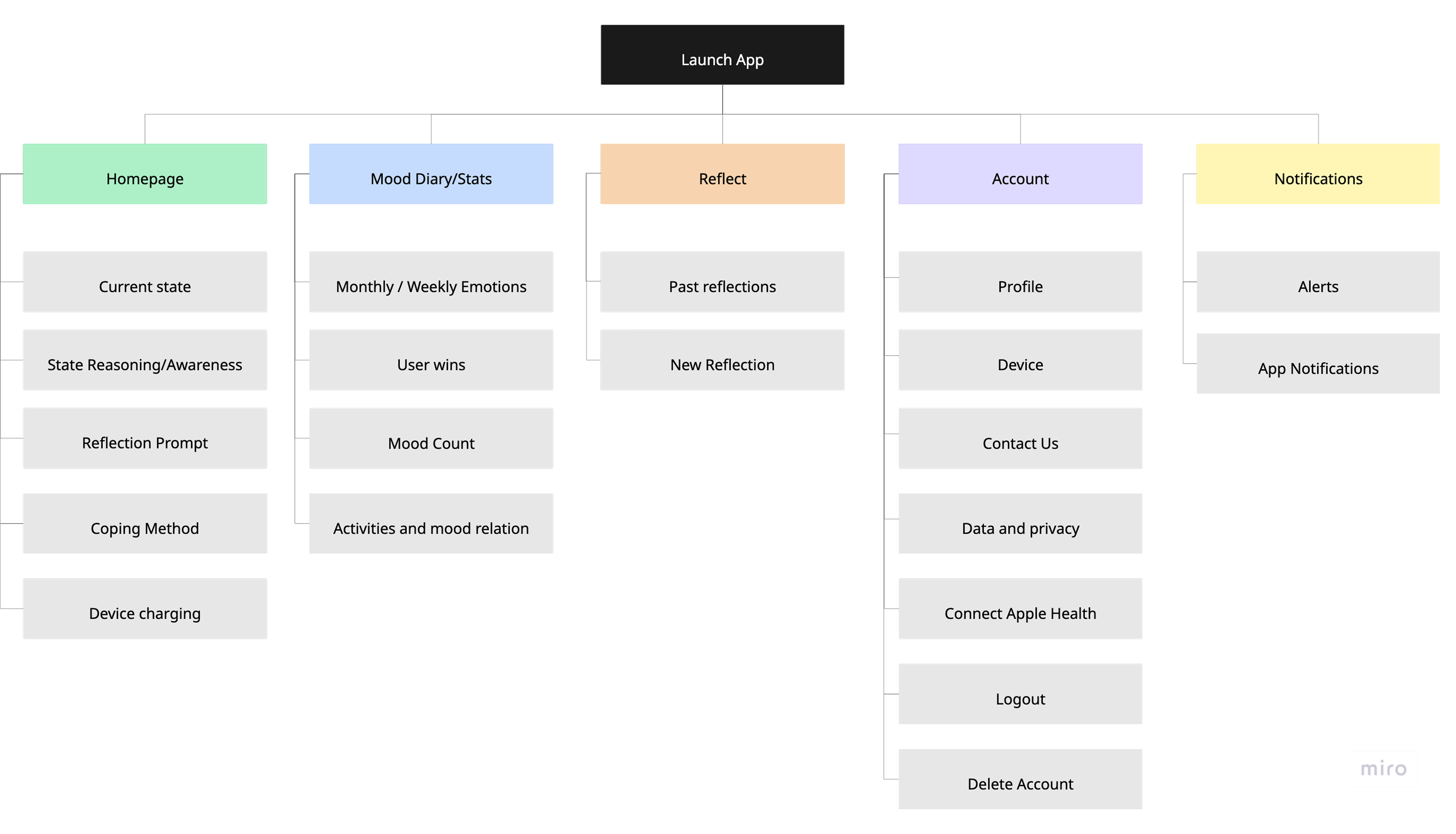
Five top-level areas, each mapped to a need surfaced in research, keeping the home screen on the current state and pushing depth into opt-in branches the user reaches only when they want them.

Information architecture, five primary areas branching from Launch App, and the full user flow from detection through reflection.

The messy process

Good design is not a straight line.

Here is where MoodMate started, and the decisions that changed along the way.

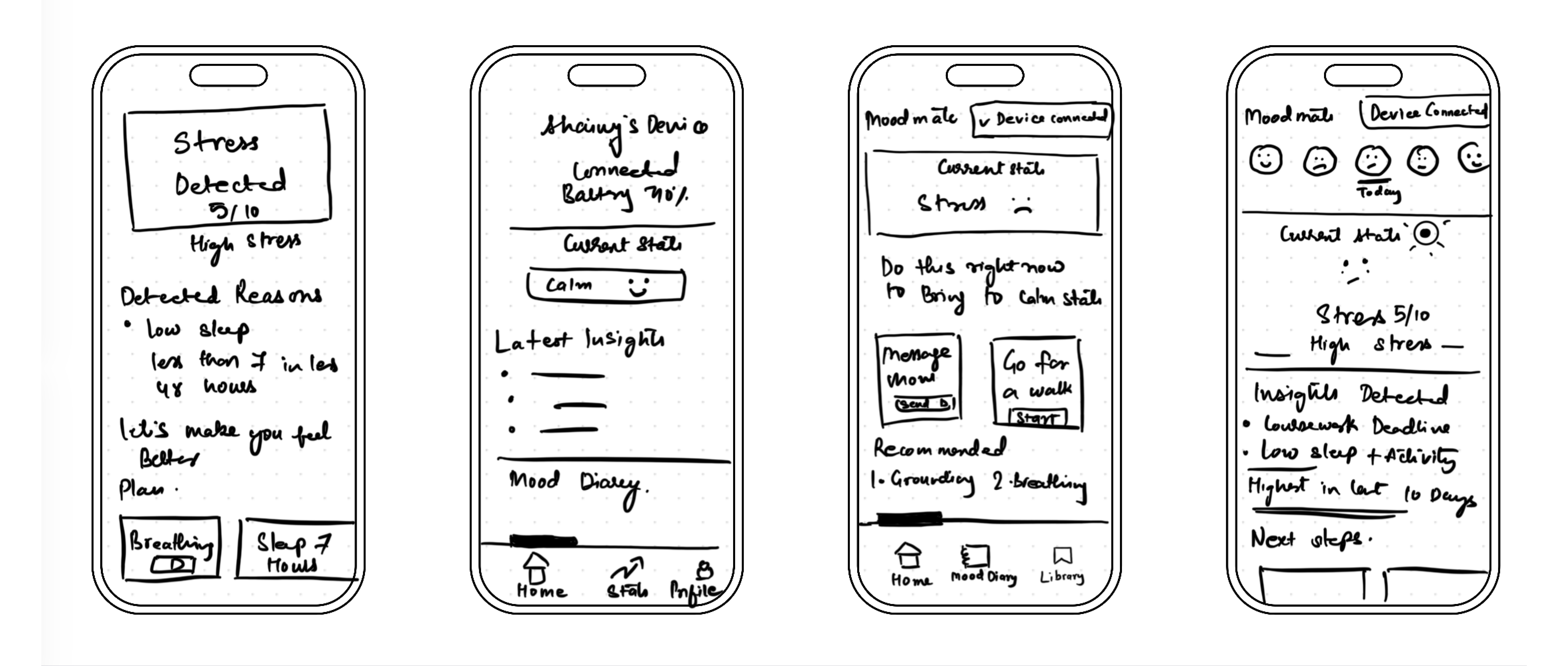
Early hand-drawn wireframes — stress detected, current state, latest insights and mood-diary flows
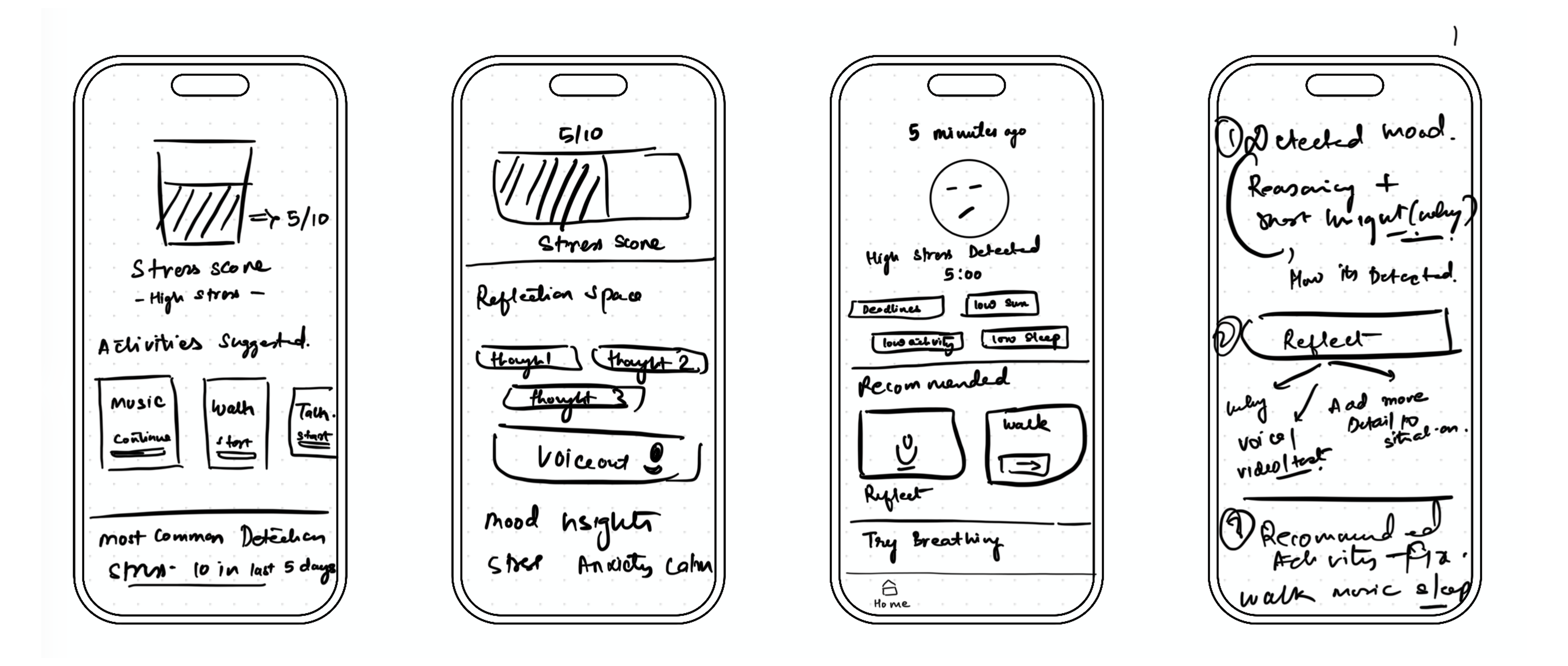
Early hand-drawn wireframes — stress score, reflection space, voice-out and recommended activities

First-pass paper wireframes, the raw ideas I sketched before anything was decided.

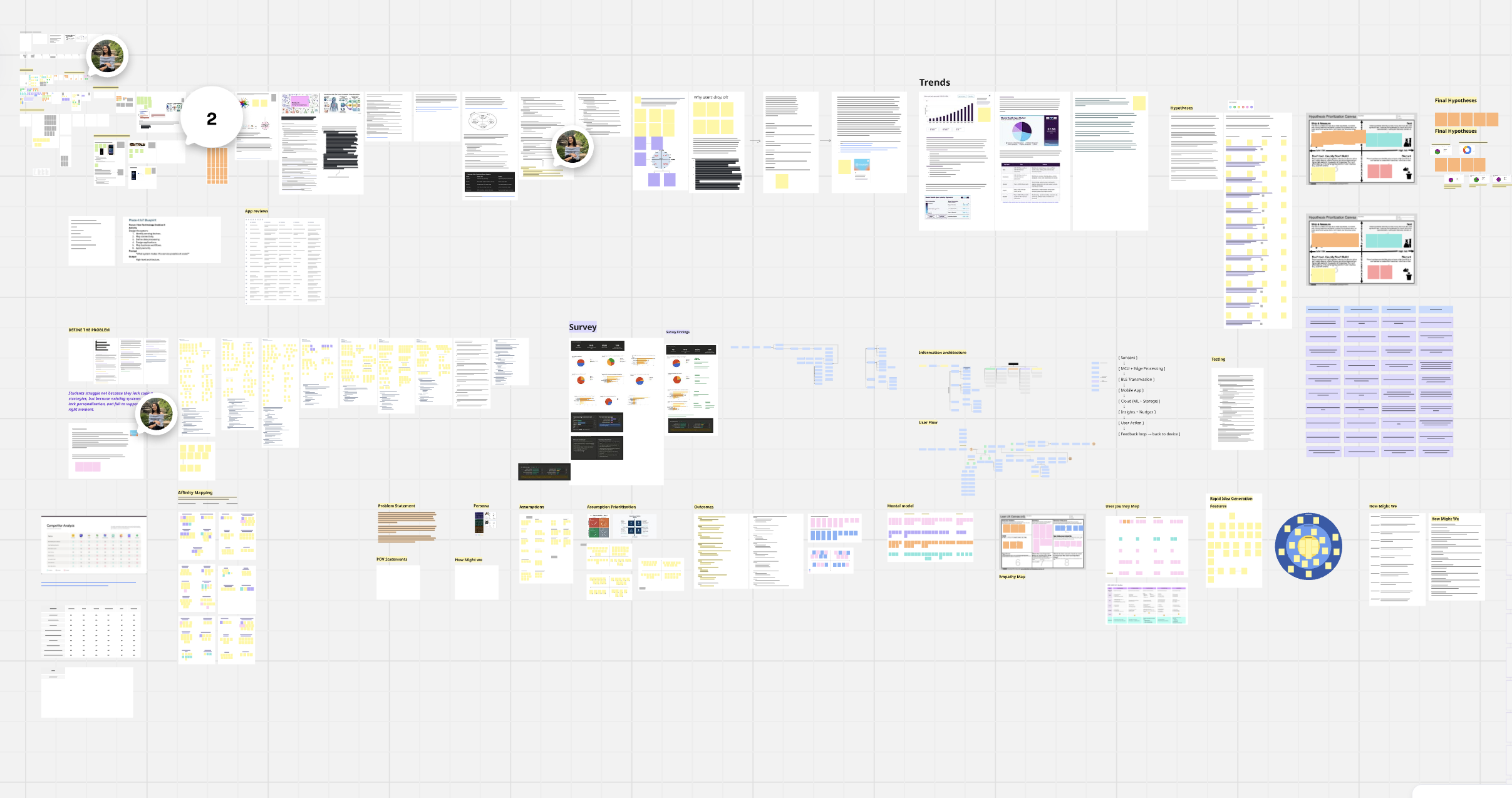
Full design-process board — research, define, ideation, IA, user flow, prioritisation and testing artefacts mapped end to end

The full working board, every artefact from research to testing, mapped end to end.

Decisions I made along the way

A few calls that shaped the design, and the reasoning behind each.

→
A personalised coping library, not a generic list

Coping suggestions started as a simple list of methods a user tended to like. That wasn't enough on its own, people also needed a gentle nudge toward positive, healthy coping mechanisms, not just familiar ones. So the library now leans toward what's genuinely good for someone, ranked by what has actually worked for them before.

→
No gamification

Rewards and streaks were on the table early on. I cut them, they risked turning a moment of real emotional support into a game. The focus stayed on genuine coping and honest reflection instead.

→
Deliberately low on numbers and jargon

I didn't want this to feel like a smartwatch dashboard. Built for a young, largely Gen Z audience, it needed to stay light on metrics and technical language, simple enough to glance at in a hard moment, not analyse.

→
Designing for emotion, not just usability

Colour, tone of voice and pacing were treated as design decisions in their own right. Warm language, soft motion and a character-led interface, principles of emotional design, made the app feel like a companion rather than a clinical tool.

How I chose

Every fork came back to the same test, does this ask less of someone at their lowest?

When an idea added friction, cognitive load or performance pressure, it got cut, no matter how engaging it looked on paper. Testing, not preference, settled each call.

Testing phase

Learnings and iterations.

I put the working screens in front of real users. Each round of feedback drove a specific change, here are the tested screens and what shifted because of them.

Medium-fidelity wireframes

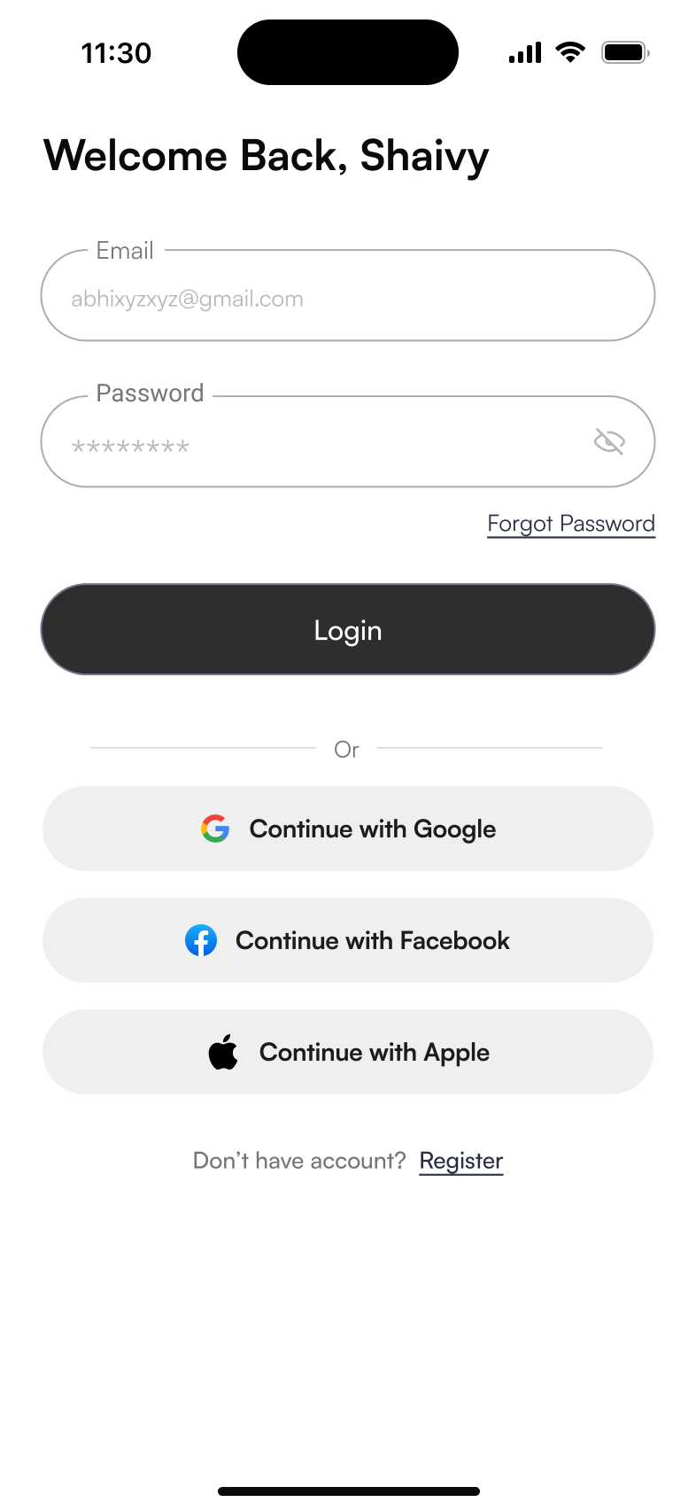
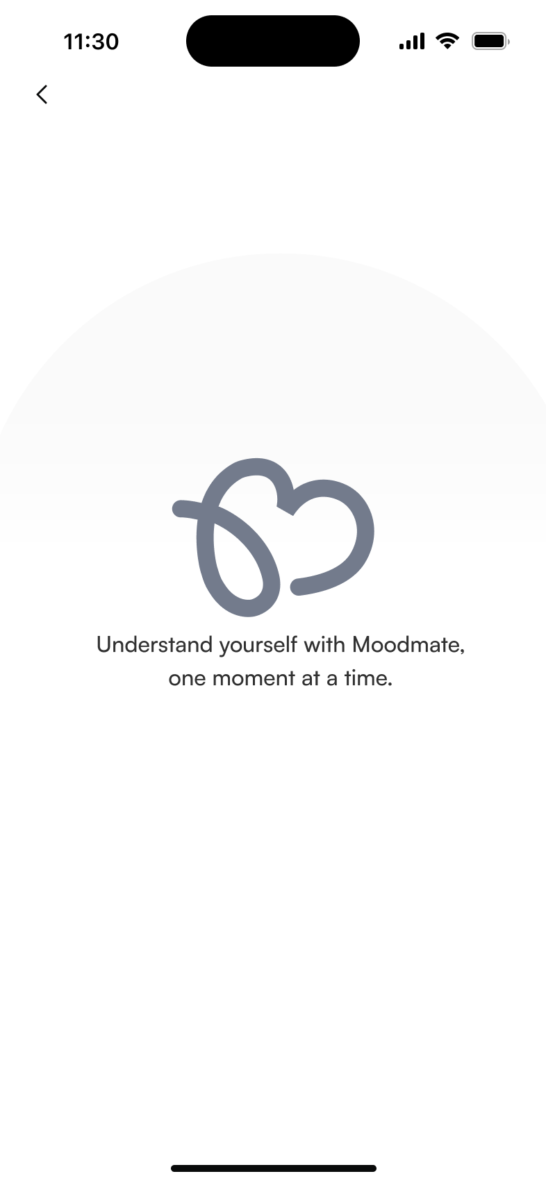
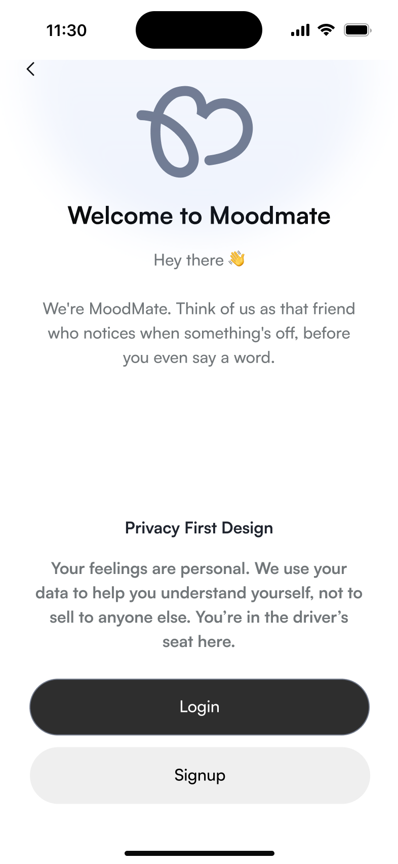
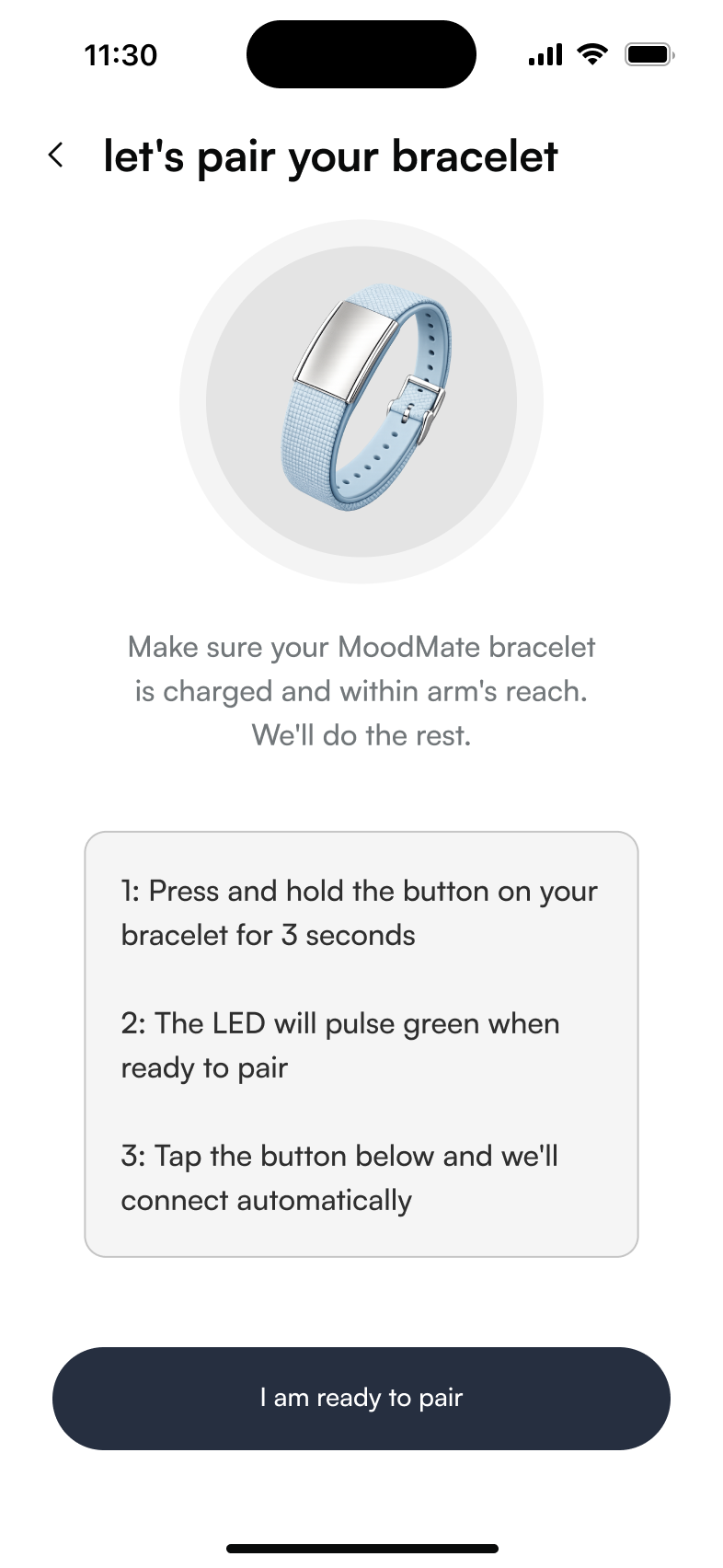
The screens put in front of users for the first round of testing.

Homepage, existing state
Login screen
Splash screen
Welcome screen
MoodMate flow screen

Screens shown in usability testing.

Medium-fidelity usability test findings

Five findings surfaced when I put the medium-fidelity build in front of a user.

→
Overall experience

The app felt intuitive, with a clear structure and features that mapped to real wellbeing needs. Navigation was generally smooth and easy to follow.

→
Navigation issues

Overlapping, visually similar icons caused confusion and raised cognitive load, pointing to a need for stronger visual hierarchy and clearer differentiation.

→
Homepage clarity

The homepage lacked immediate contextual value and personalisation, weakening first-time onboarding and early engagement.

→
Tone of voice

The copy read as too direct and robotic. The user expected a more empathetic, calm and conversational tone suited to a mental-health context.

→
Coping methods section

The coping-methods feature was unclear and not interactive enough, causing hesitation and low engagement. It needs more guided, structured interaction design.

2nd iteration · high-fidelity usability test findings

The high-fidelity build went back in front of users, here's what landed and what still needed work.

What worked

→
Visual design

Users responded very positively to the look and feel of the app.

→
Smooth, intuitive flow

The flow felt smooth, and most features were easy to understand with little effort.

→
Low-friction feel

The experience felt approachable and friendly, low-friction from first open.

→
Emotionally supportive

Users described it as emotionally supportive, almost like interacting with a companion.

Opportunities for improvement

→
"Reflect" label mismatch

The nav label was read as reviewing past emotions rather than journaling, a mental-model mismatch.

→
Vague emotional feedback

Feedback messages felt vague and unclear, reducing trust in how the system represented user states.

→
Insight and action, disconnected

Users expected coping strategies right after emotional insights, the gap between the two broke flow continuity.

→
What it points to

Clearer labels, more explicit emotional feedback, and a tighter link between insight and coping action.

Final feature set

Prioritising what made the cut.

I ran every candidate feature through a bullseye chart and a prioritisation matrix, keeping only what served the person in the moment and cutting the rest.

What I kept, and why

Only the features that lower friction at the lowest moment earned a place in the core.

Passive haptic detection, the coping library, Voice Dump and the self-understanding space all mapped to a validated theme and landed high-value, low-effort. Gamification, manual mood logging and generic tips scored low on value and were cut, no matter how familiar they looked.

Passive haptic detection Coping library Voice Dump Self-understanding space

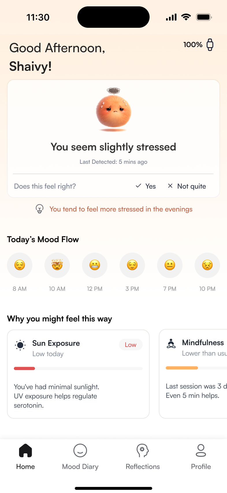
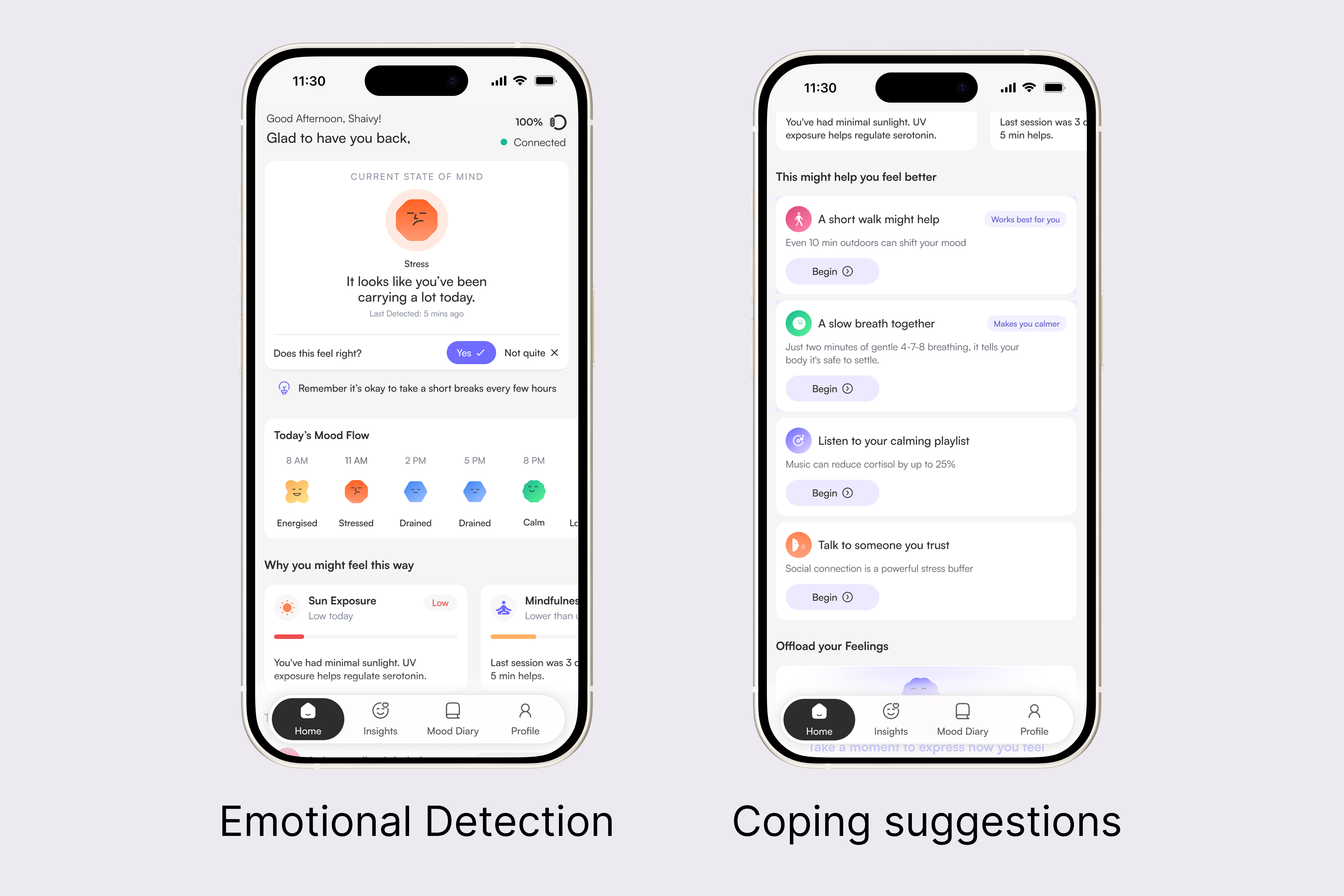
The home screen surfaces the detected emotional state with the blob character, state label, and a plain-language summary. Factor cards explain the contributing biometric signals, sleep duration, sun exposure, and mindfulness recency, so users understand why they feel a certain way, not just what they feel. A mood override lets users correct the detection, and today's mood flow shows the full day as an emoji timeline.

MoodMate home screen, detected state leading into coping suggestions

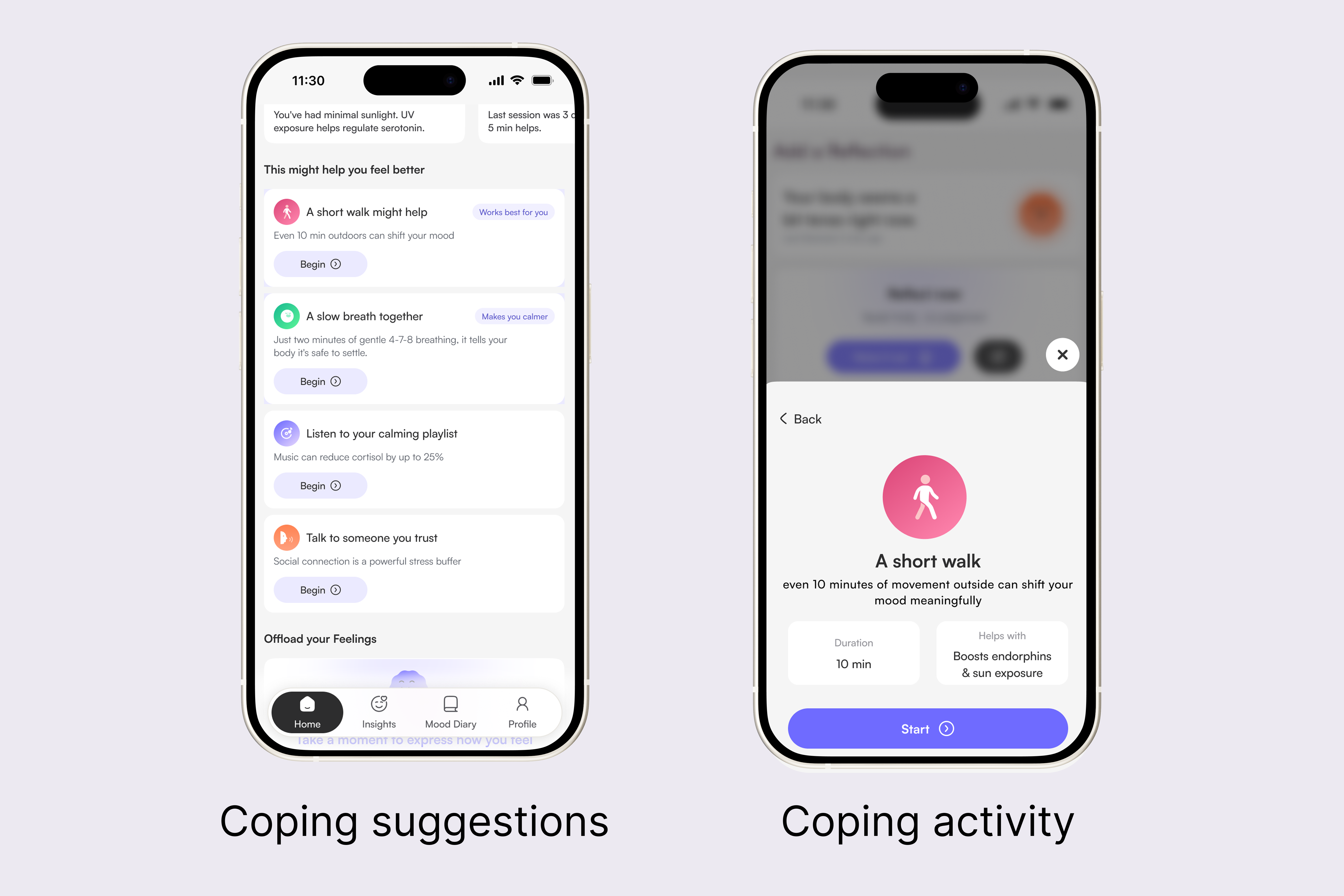
Usability testing surfaced a clear ask: people didn't want a generic, guided routine, they wanted coping methods personalised to them. In a low moment, users often don't know what to do next, so MoodMate meets them where they are rather than asking them to do something that doesn't fit. Suggestions are drawn from a mix of passive signals and past behaviour, which makes reaching for a healthy coping method feel far more reachable in the moment. Underneath, the AI learns from each session's outcome, tracking which method actually improved a user's state, so it can prioritise what has worked best for them, walking, breathing, music, over generic tips.

Coping suggestions list and a guided coping activity

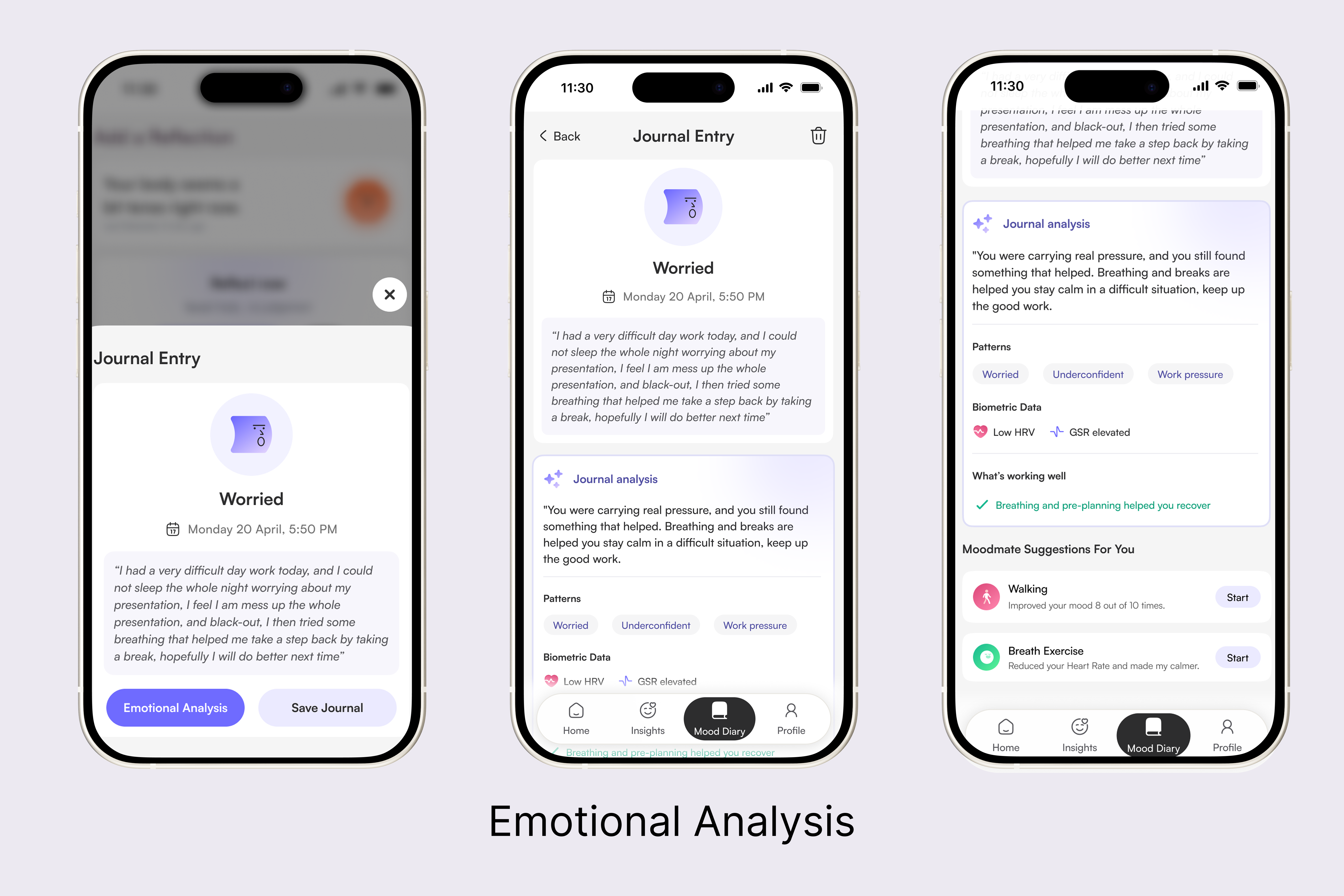
The Mood Diary screen supports multimodal input, voice or text, based on the user's preference in the moment. Optional pre-prompts such as “what triggered this feeling?” reduce the blank-page barrier without imposing structure, and the AI analysis that follows is entirely optional, users can offload without engaging with insight. When they do open it, the AI identifies emotional themes and categorises them into recognised patterns, worry, underconfidence, work pressure, contextualises them within the user's broader emotional history, surfaces what is working well, and cross-references the entry with biometric data at the time of writing, such as elevated GSR or low HRV.

Journal entry moving into AI emotional analysis

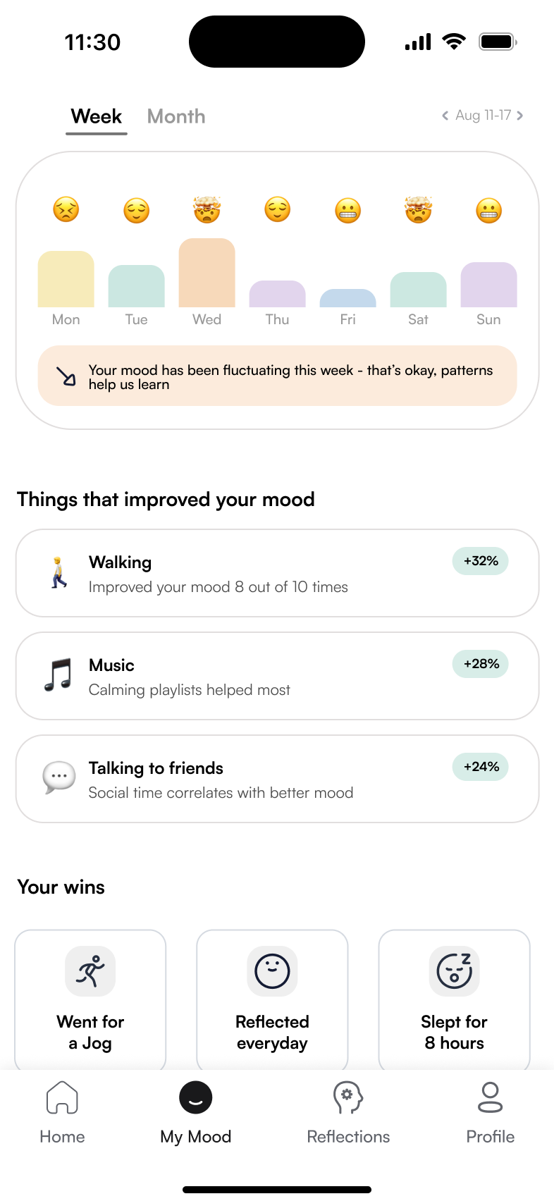
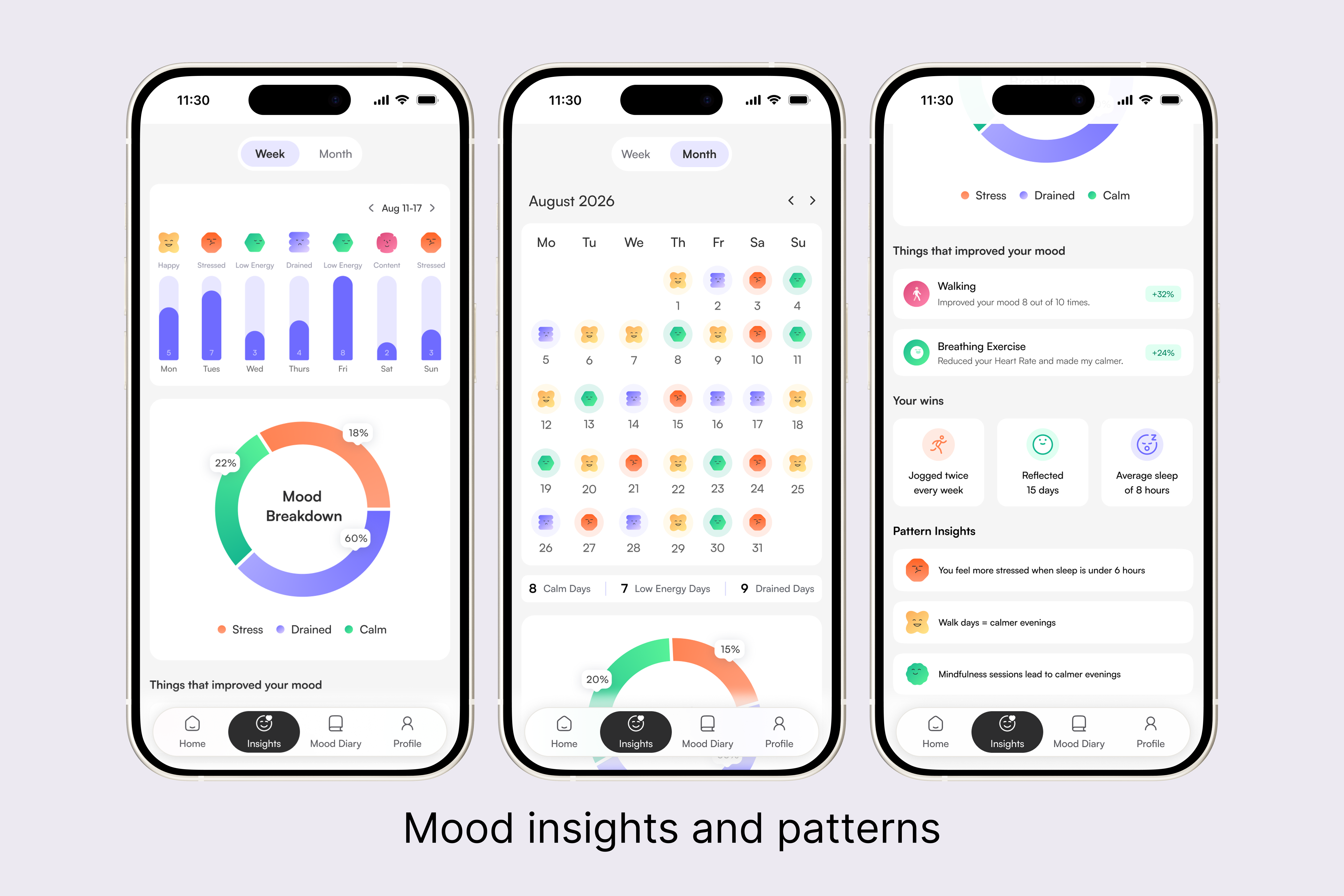
The Insights screen provides a longitudinal view of emotional wellbeing across weeks and months, combining bracelet biometric data with AI pattern recognition. Weekly emotional states are shown as a friendly emoji strip with a mood breakdown, rather than clinical charts.

Insights weekly and monthly views with wins and pattern insights
Final designs

The product, in motion.

A short walkthrough of the final flow, from a detected spike on the wrist to reflection in the app.

Final walkthrough video of the MoodMate experience.

Evaluation
Tested, not assumed.

I evaluated MoodMate with a System Usability Scale survey alongside think-aloud usability sessions, watching people move through the flow and narrate their reactions in real time.

It scored 96 on the SUS, top-tier by any benchmark, but that number was never the end goal. The real impact came from the feedback along the way: five specific findings in the first round and four more after the high-fidelity pass, each one a concrete change to the product, not just a score to report.

96 SUS 4.8/5 coping effectiveness 4/4 hypotheses validated

What's next

This was the MVP, every hypothesis testing clean is the signal to build further rather than stop. Next, I'd bring AI further into the experience, a conversational layer running throughout the app rather than confined to journal analysis, using more conversational AI principles so it feels like a natural back-and-forth rather than a feature. I'd also lean on the metrics MoodMate already collects to make each section more personally aligned, helping people track their own mental-health patterns and build emotional self-awareness over time.