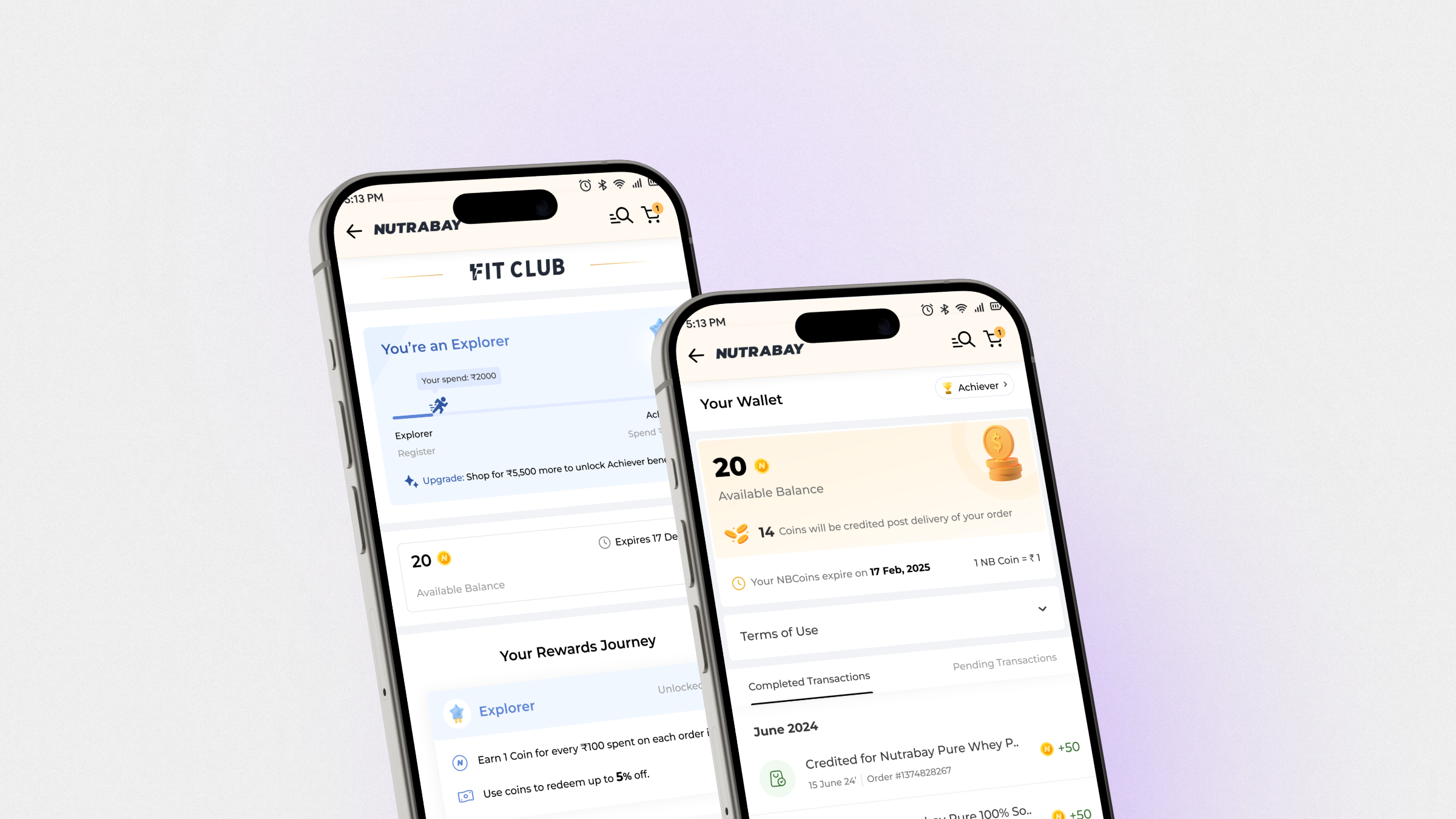
Nutrabay Fit Club: Designing a Loyalty Programme from Zero
Nutrabay had a retention problem. Users were buying once and not coming back. Fit Club is the loyalty programme we designed to change that, a tiered rewards system built around transparency, genuine value, and the specific psychology of repeat purchase behaviour.
The impact, up front.
Within 90 days of launch.
Within 4 weeks of launch.
For Fit Club members vs non-members.
At checkout.
On orders where coins were applied.
For the Fit Club experience.
Metrics reflect the first 90 days post-launch. Collected in collaboration with the PM and data team.
Conversion was fixed, retention wasn't.
Nutrabay's conversion rate had improved following the homepage and PDP redesign. But conversion is only half the equation. Users who made a first purchase were not returning at the rate the business needed. In a category where the same user buys the same protein every 6–8 weeks, low retention is a structural revenue problem, not a satisfaction problem.
The PM brought data showing users who made a second purchase within 30 days had significantly higher 6-month lifetime value. The question became: what gives a user a concrete, felt reason to come back to Nutrabay specifically, rather than going to a competitor at a similar price?
The answer was a loyalty programme. But loyalty programmes fail when they feel complex, opaque, or when the value is hard to reach. The design challenge was to build one that felt like genuine reward, not a mechanism designed to extract more purchases.
How we decided what to build.
Fit Club didn't start with a design brief. It started with a business question: what would make a user come back specifically to Nutrabay, rather than buying the same product from a competitor at the same price? The answer, a loyalty programme, was only the beginning. The harder question was what kind.
Over several weeks of conversations between PM, engineering and design, we worked through multiple reward structures before landing on the one we built. Early concepts included a cashback model, a discount-stacking model, and a points-only model with no monetary equivalent. Each was evaluated against three criteria: does it feel like genuine value to the user, is the cost sustainable for the business, and can it be built within the current infrastructure?
The NB Coins system, where 1 coin equals ₹1 with no conversion rate, emerged from that process. It was not the first idea. It was the one that survived scrutiny from all three directions.
The PM's first pass had Gold tier at ₹10,000 cumulative spend. Research said this would feel out of reach for most users, and a tier that feels unreachable creates no motivation to try. We ran multiple iterations of the threshold structure, modelling what percentage of the existing user base would reach each tier within 3, 6 and 12 months. Final thresholds were set so that a regular buyer, someone ordering every 6–8 weeks, could reach Gold within a realistic timeframe. Each tier had to feel like a genuine achievement, not a name tag given to a small percentage of power users.
The coin earn rate and redemption limits needed to feel different enough between tiers to justify progression, but not so different that Silver felt pointless. We modelled the actual rupee value a user would accumulate at each tier over 6 months based on average basket sizes. The goal: each tier delivers noticeably better perceived value. This is where LTV came in directly, a Platinum user spending more frequently was significantly more valuable than three Silver users spending occasionally. The reward structure was designed to reflect and incentivise that.
1 NB Coin = ₹1 was the clearest transparency decision on the project. Loyalty programmes that use proprietary currency with unclear exchange rates are consistently rated lower for trust. We made the value immediately legible, users never calculate what their coins are worth. Calling it NB Coins rather than points or credits was also deliberate: coins feel earned and tangible, and the NB prefix carries the Nutrabay brand directly. In user interviews, participants used the phrase "my coins" within one session, the possessive language that indicates felt ownership and increases redemption likelihood.
Two early sessions with both engineers mapped the coin engine constraints before wireframes started. Key finding: real-time balance updates at checkout required a backend sync delay of ~2 seconds. Rather than treating this as a later problem, we designed around it from the start, a confirm-then-apply redemption pattern that set the right user expectation. Bringing engineering in before wireframes was one of the reasons the 6–8 week timeline held.
The programme structure was agreed before any screen was designed. The design work was faster because the thinking was done first.
Designing for integration, not addition.
Fit Club had to integrate into an existing app with established page structures, the homepage, PDP, cart, account section, without disrupting any of them. Every touchpoint where Fit Club needed to appear already had its own hierarchy, its own information density, its own user purpose.
The design constraint: Fit Club's presence on any existing page had to feel native to that page, not grafted onto it. A cart user is evaluating a purchase, the coin redemption widget needed to sit within that decision without hijacking it. A PDP user is assessing a product, a Fit Club coins indicator had to give relevant information without adding cognitive load to an already dense page.
Every Fit Club component, the coin balance chip, the tier badge, the redemption toggle, the savings display, was built as an extension of existing component logic rather than a new design language layered on top. The result is a loyalty programme users encounter naturally across the app rather than a separate module they have to remember to visit.
The measure of good integration is that it doesn't look like integration. Fit Club components on the PDP and cart were designed to feel like they had always been there.
What users actually told us.
Users were open to a structured programme, but only if payback was clearly visible within 1–2 orders. "If I can recover the cost soon, I'll buy it." The landing page had one job: show what you get, not how the system works.
Users who had experienced opaque programmes before came in sceptical. Hidden fees, unclear expiry rules, and hard-to-reach milestones had broken their trust elsewhere. Transparency was the entry fee, not a differentiator.
"I kept items in my cart to hit the 2k mark and get a free gift." Milestone proximity was a real purchase trigger, but only when it was visible. Users who didn't know how close they were to a tier upgrade had no motivation to add more.
Users responded more emotionally to "you've saved ₹340" than "you have 340 coins." The emotional response to money saved was stronger than the cognitive response to points earned. This shaped the savings display directly.
Higher tiers created genuine aspiration, but only when the upgrade path felt within reach. If the next tier felt arbitrary or distant, users disengaged rather than aspired.
"Users didn't want to feel managed by a loyalty programme. They wanted to feel rewarded by one. That distinction shaped every hierarchy decision."
Two shoppers, two different reasons to join.
The interviews collapsed into two recurring profiles, a price-conscious first-timer deciding whether the programme is worth it, and a loyal repeat buyer who already expects to be recognised for it. Every decision in this case study was checked against both.

"If I can recover the cost in 2 orders, I'm in."
A gym-going first-time supplement buyer, 18 months in, restocking the same whey protein every 6–8 weeks. He compares Nutrabay's price against competitors before every order and needs to see the payoff before he commits to anything.
- Build muscle and track fitness goals
- Save money on repeat supplement orders
- Find trusted, authentic brands without switching platforms
- Visible savings shown in rupees, not points
- Tier progress nudges showing how close he is to the next milestone
- Quick one-tap reorder of his regular products
- Can't easily tell if the programme is worth it before joining
- Forgets to use coins at checkout, doesn't see them until it's too late
- Restocks the same product every cycle but has to search from scratch each time

"I kept adding to cart to hit the next tier. Just show me how close I am."
A loyal repeat buyer ordering every 3–4 weeks for herself and her partner. She's brand-loyal and expects the programme to recognise her frequency, not treat her like a first-time buyer.
- Earn visible tier status as recognition for loyalty
- Maximise savings across every order
- Fast, frictionless restocking of her regular product list
- A tier status badge visible on her profile, recognition matters
- Exclusive top-tier benefits that feel genuinely different
- Expiry alerts so she never loses coins she has earned
- Coins expire without any warning, discovered only at checkout
- Tier benefits are not clearly explained anywhere she can find
- No sense of recognition despite being a frequent buyer
Rohan needed proof of value before joining. Priya needed proof of recognition after joining. The landing page was designed for Rohan, the tier progress page was designed for Priya.
How might we respond?
How might we make the value of the programme immediately clear, before a user has to commit?
How might we build trust through radical transparency, showing costs, expiry and limits upfront?
How might we make milestone progress visible at every touchpoint, not just on the Fit Club page?
How might we frame rewards as savings, so users feel the value rather than calculate it?
How might we make tier progression feel aspirational and achievable at the same time?
How might we borrow from gamification, Nir Eyal's Hook Model, trigger, action, variable reward, investment, so earning and redeeming feels like a loop worth returning to, not a one-off discount, and the user comes back for the next hit of delight rather than just the next order?
One hub, four entry points.
Fit Club couldn't live on one page. Users needed to reach it from wherever intent already existed, homepage banner, PDP earn callout, cart's spend nudge, account navigation, so the IA maps every entry point back to a single membership hub rather than treating Fit Club as a bolt-on destination page. The hub itself branches by tier (Explorer, Achiever, Legend), so a user only ever sees the ladder rungs relevant to where they stand, not the full programme mechanics at once, which keeps the page scannable for a returning Explorer checking their next milestone versus a Legend managing wallet transactions.
The wallet is deliberately modelled as its own branch off the hub, not nested inside account settings, because it's the highest-support-load surface: balance, expiry, pending vs. active transactions and edge states (negative balance, expiring coins, partial redemption) all needed to be reachable in one hop so a confused user could self-serve instead of raising a ticket.
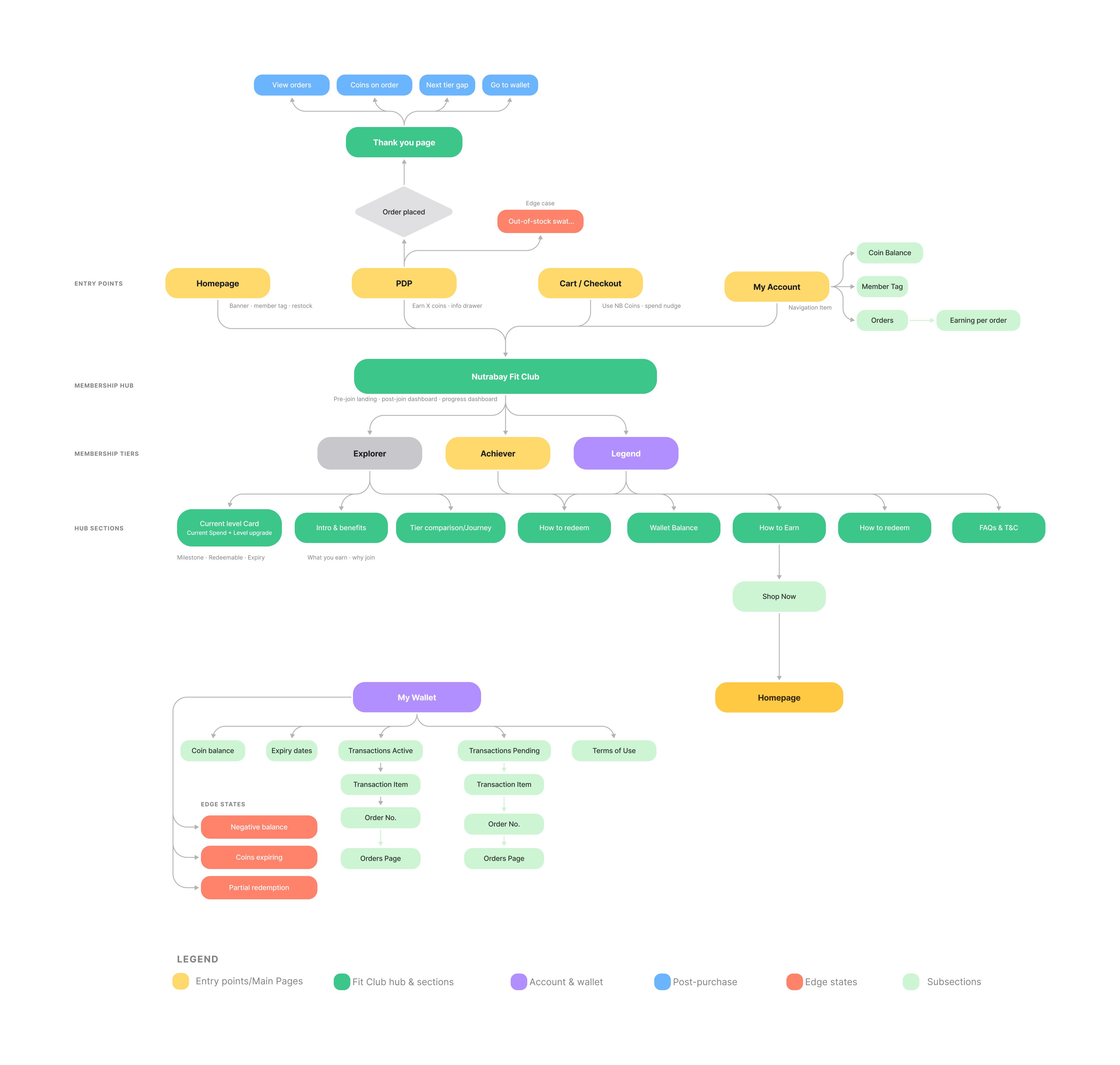
Colour coding by node type (yellow entry points, green Fit Club surfaces, purple account/wallet, red edge states) was itself a UX decision: it let engineering and PM scan the map for build scope by colour before reading a single label. Click the diagram to view it full screen.
First purchase, coins credited.
Before any screen was designed, the core loop was mapped end to end, from homepage to a completed purchase to the moment a first-time user actually understands what just happened to their coin balance. This flow, delivery plus 15 days, first coins credited, is what the landing page, PDP and post-purchase messaging in this case study were built around.
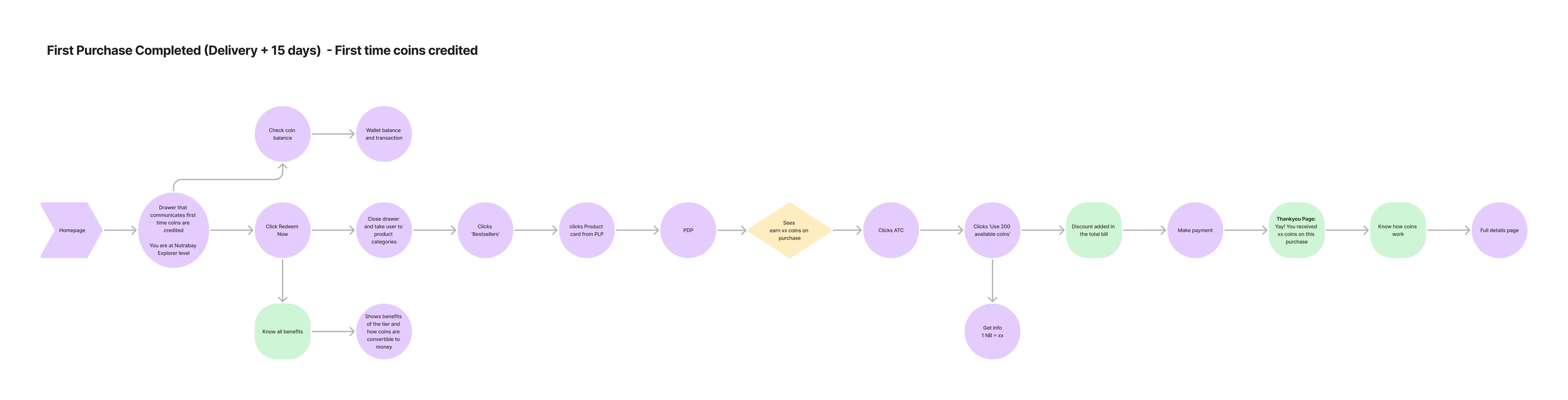
The flow surfaced a gap early: nothing told a first-time buyer what "200 coins" actually meant in rupees at the moment they'd earned them. That gap became the "1 NB Coin = ₹1" rule stated at every earn and redeem point in the final design. Click the diagram to view it full screen.
Initial sketches, before any pixel was pushed.
Paper first. The five research findings were tested as rough structural bets, wallet balance placement, tier progression as a locked/unlocked list, the earn-and-redeem loop, before any visual design started. Sketching cheaply meant the bad structural ideas died on paper, not in Figma.
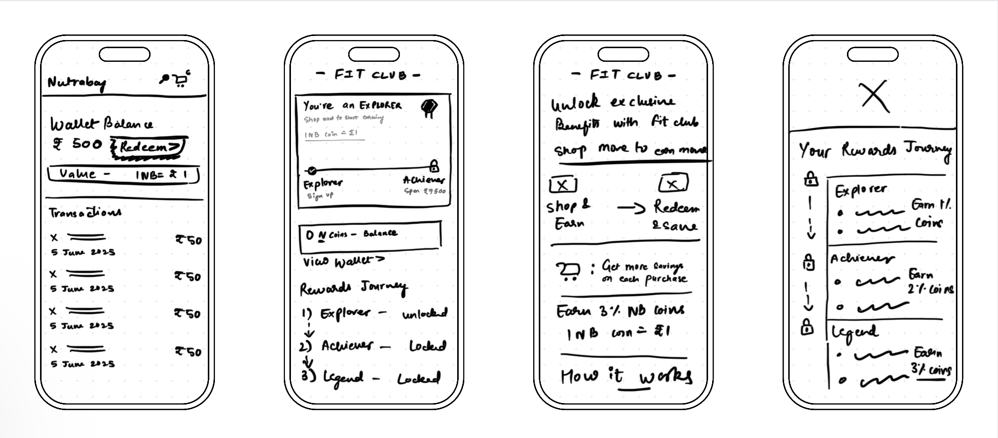
The locked/unlocked list pattern and the earn-and-redeem two-step loop survived from sketch to final screen almost unchanged. What changed was everything around them, hierarchy, copy, and where value was stated in rupees instead of coins.
Understanding the system before designing it.
Tier structure, coin earn rates, redemption limits and upgrade thresholds were all agreed with the PM before wireframes started. Understanding this system was what made the design decisions possible.
| Tier | Unlock threshold | NB Coins earned | Redemption limit |
|---|---|---|---|
| Explorer | Register | 1 coin per ₹100 spent | Up to 5% off |
| Achiever | Spend ₹7,500 | 2× Explorer | Up to 10% off |
| Legend | Spend ₹20,000 | 3× Explorer | Up to 15% off, free delivery, priority support |
1 NB Coin = ₹1. No conversion rate to calculate. If users have to do maths to understand their reward, the programme has already failed.
Design decisions that shaped the programme.
Two behavioural frameworks informed the overall programme design, used as lenses for evaluating decisions, not as a checklist.
Trigger, action, variable reward, investment, maps closely to how a loyalty programme should work: a coin balance notification (trigger) prompts a purchase (action), which delivers a reward that varies by basket size (variable reward), and builds a history that makes switching away more costly (investment). The programme structure was evaluated against each stage of this loop.
Motivation × ability × prompt shaped specific placement decisions. A redemption widget only converts when motivation is high, ability is high (one tap), and the prompt appears at the right moment (checkout, not buried in a wallet). All three conditions must be met simultaneously. This is why placement was treated as a product decision, not a layout decision.
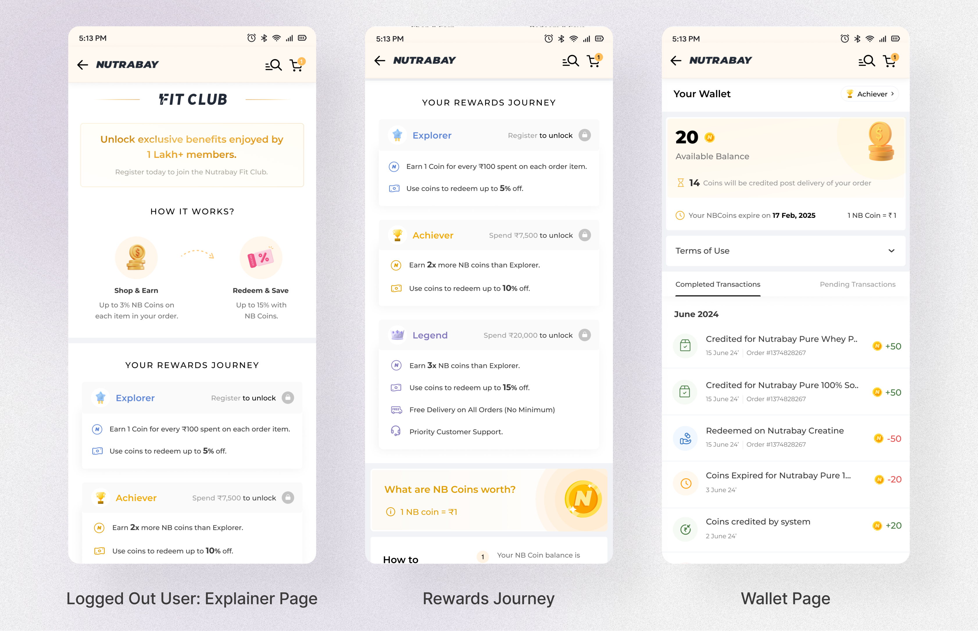
A logged-out visitor, a newly-registered user and a returning member are three different people with three different questions. These three screens were designed to answer each question in order, without ever making the next one wait.
A logged-out user has no reason yet to care about tiers or coin rates. The page leads with a plain-value headline, "unlock exclusive benefits enjoyed by 1 lakh+ members," and a two-step shop & earn / redeem & save loop, each with one concrete number. The information hierarchy is deliberately shallow: value first, social proof second, mechanics only once the user has scrolled past both. Its only job is to make a logged-out visitor want to start the journey, not to teach them the system.
Every tier is always visible, including the ones a user hasn't reached, with a clear lock icon and the exact spend needed to open it. Showing the whole ladder up front, rather than revealing tiers as users approach them, turns the higher tiers into a visible goal from day one instead of a surprise later.
The wallet separates Completed and Pending transactions into their own tabs, and every line shows the order it's tied to. This was a direct response to a real support cost: users who can't tell why a balance changed raise a ticket. Giving people the full, dated history of every coin earned, redeemed or expired answers "why is my balance what it is" before the question gets asked, reducing the load on customer support and, more importantly, removing the moment of doubt that erodes trust in the programme.
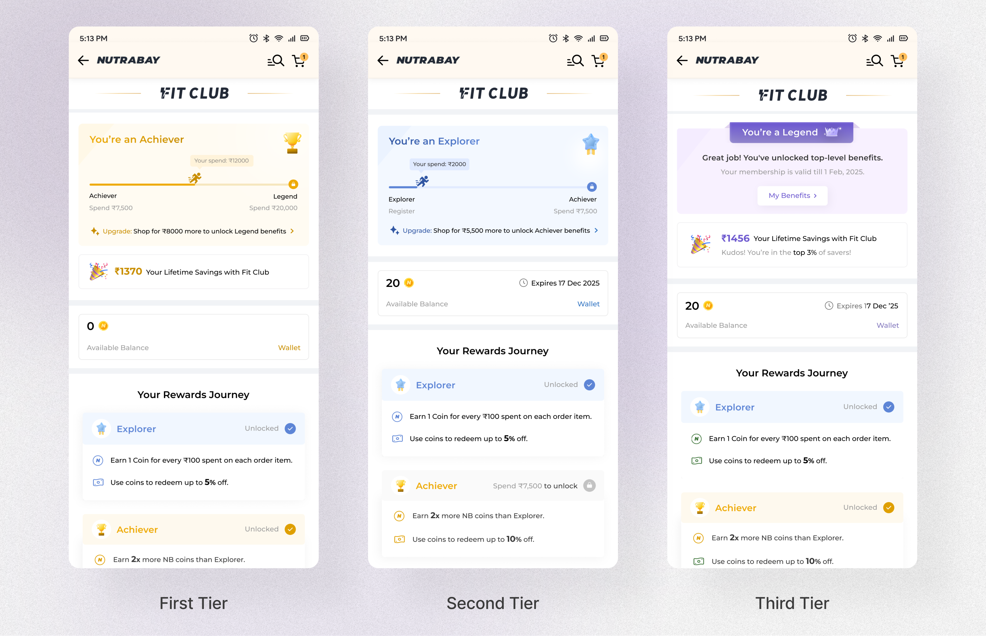
A returning user's page has one job: make the distance to the next reward feel close and make the tier they're already in feel like an achievement, not a starting line.
Every tier is addressed in the second person and named, never numbered: "You're an Explorer," "You're an Achiever," "You're a Legend." Even a user on the very first tier is told what they are, not what they lack, calling it "Explorer" rather than "Basic" or "Tier 1" gives day-one users a title to feel ownership over instead of a placeholder to outgrow. The vocabulary, Explorer, Achiever, Legend, is pulled from health and sports language to match the brand, the same register as a fitness milestone, not a banking or points programme.
The user's current spend is plotted as a filled bar between their current tier and the next one, with a small running-figure marker at their exact position, so "where do I stand" is answered visually in half a second rather than by reading two numbers and subtracting them. A progress bar was chosen deliberately over a text-only stat because position on a line is processed faster than a percentage, this is the same reasoning behind loading bars and fitness-ring UI. Beneath it, every version of this page states the same upgrade nudge in plain language, "shop for ₹8,000 more to unlock Legend benefits," in rupees, never a percentage. This was a deliberate information-design choice: a user should never leave this page without knowing exactly how much more gets them to the next tier and what that tier unlocks. Pairing a visual position with a written distance means the page works whether a user skims or reads.
Each tier has its own colour identity that escalates in perceived value: blue for Explorer, gold for Achiever, purple for Legend. Purple was chosen deliberately for the top tier, it's the colour most consistently associated with premium and exclusivity across the categories we benchmarked, so a user recognises they've reached the top of the ladder before they've read a single word.
At the Legend tier, the lifetime savings line adds a ranking, "you're in the top 3% of savers," instead of stopping at the rupee amount. The UX decision here is about what makes a number feel earned: "₹1,456 saved" is just an amount, but "top 3% of savers" tells the user where that amount places them against everyone else on the programme, converting a private saving into a form of status. It's shown only at the top tier on purpose, so it reads as a rare, earned distinction rather than a generic congratulations message every user sees.
Available balance, expiry date and current tier are restated on nearly every screen in the programme, even though the information hasn't changed since the last one. This was intentional: Nielsen's "recognition rather than recall" heuristic holds that a system should keep essential status visible rather than ask users to remember it. In a programme the company controls the rules for, a user should never have to hold "how many coins do I have" or "am I close to upgrading" in their head. Repetition here isn't redundancy, it's what keeps the user feeling in control of a system they don't own.
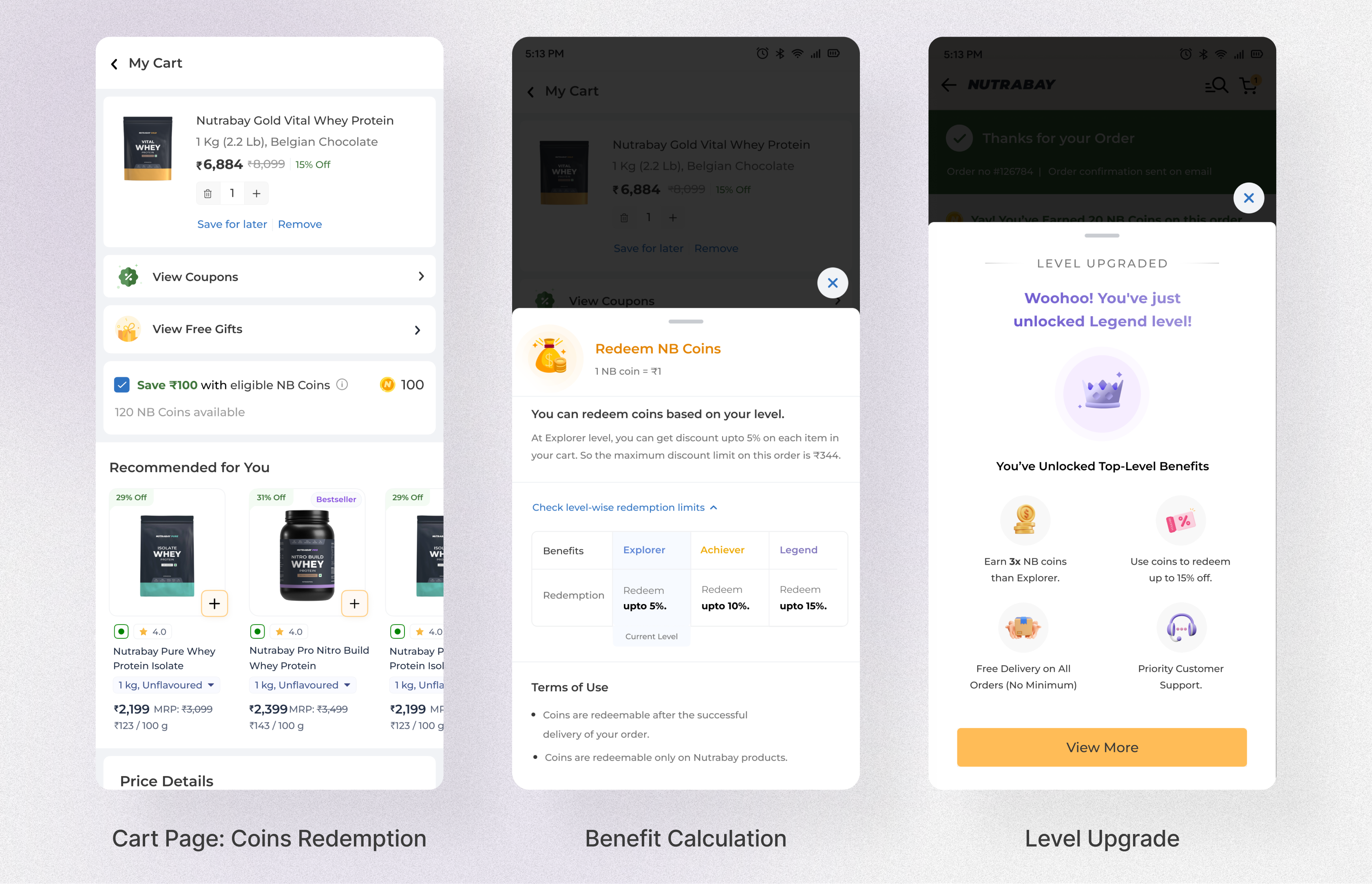
The last mile of the programme is where trust is either confirmed or spent: the moment a user tries to actually use what they've earned.
The coin redemption checkbox sits directly above the price breakdown in the cart, the exact moment a user is evaluating their spend, rather than in a wallet they'd have to leave checkout to visit. Loss Aversion (Kahneman): seeing available coins at the point of decision makes not using them feel like a loss, a wallet widget never creates that moment. This single placement decision is what took redemption to a 62% rate at checkout.
This tier-by-tier redemption table appears in two places: on the product card in listings, and again on the product page itself, exactly where a user is deciding whether to purchase. Tapping it doesn't just show a bare percentage, it states a worked example for the user's own tier: "at Achiever, you can redeem up to 10%, so on a ₹2,000 order your maximum discount is ₹200." This follows Don't Make Me Think: a user shouldn't have to run their own maths against a rate card to know what a purchase will actually cost after coins, the interface should do that arithmetic and state the answer.
What's next: a per-product calculator that reads the item in the user's cart and states, before checkout, exactly how many coins that specific order will earn and how much of it can be redeemed.
Reaching a new tier triggers a full-screen celebratory moment immediately, not a quiet balance update discovered later in a wallet. Positive Reinforcement: behaviour that is rewarded is repeated, and a reward only lands as a reward if the user feels it at the moment it's earned. This is also where the emotional and the transactional UX meet: the modal restates the new tier's benefits in full, so the celebration doubles as the next nudge to keep spending.
Result: 62% redemption rate at checkout.
Designing for what goes wrong.
A loyalty programme generates edge cases that don't exist in standard e-commerce, negative balances, expired coins, partial redemptions, refunds affecting coin totals. Every edge case we didn't design for was a moment where the programme would break a user's trust.
Engineering surfaced a scenario where partial redemptions combined with a refund could produce a negative coin balance, a state the UI had no way to handle. We designed a locked redemption state with a plain-language explanation and an estimated recovery date. No vague error states, no dead ends.
A user with coins about to expire reaches checkout. An expiry nudge appears in the redemption widget, "Your coins expire in 3 days," prompting redemption without alarming the user. The nudge appears only when expiry is within 7 days.
When a product already has a promotional discount applied, coin redemption rules change. We worked with the PM to define the business logic, then designed a state that showed users exactly how much they could still redeem, rather than silently limiting the amount and letting users discover it mid-checkout.
11 edge cases were documented and designed before development started. Zero UX-related bugs in the first launch cycle.
What I'd carry into the next programme.
The most important decisions on this project, tier thresholds, coin parity, upgrade logic, redemption limits, were not made in Figma. They were made in conversations with the PM, grounded in retention data and LTV modelling. Understanding why a second purchase within 30 days was the key lifetime value inflection point changed how I prioritised the design work. The post-join progress page and checkout redemption placement weren't aesthetic choices, they were directly targeted at that 30-day window. Business acumen is not separate from UX thinking. On a project like this, it is the UX thinking.
Gamification only works when users believe the programme will deliver on what it promises. The temptation in loyalty design is to lead with aspirational mechanics. Research told us that users who had been burned by opaque programmes before came in sceptical. Designing transparency mechanisms first, coin expiry visibility, spending limits table, clear upgrade thresholds, 1:1 coin parity, was what made the gamification land rather than feel manipulative. You cannot skip to the delight before you have earned the trust.
The 62% redemption rate did not come from the quality of the redemption UI. It came from where it sat in the flow. A well-designed redemption widget buried in the wallet would have been ignored. The same widget placed above the price breakdown at checkout, at the exact moment users are evaluating their spend, activates a completely different response. Loss aversion: users who see available coins at the point of purchase feel the cost of not using them. That single placement insight is worth more than any visual decision made on this project. Where something appears is as much a design decision as what it looks like.